
Update 4th June 2026: added 6 new chart types, convert line/bump charts to continuous paths
Working smarter 🍯🐝
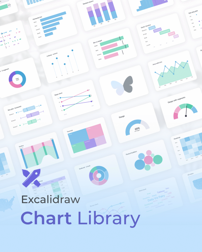
I’m excited to share that I made my own chart library for wireframing in Excalidraw.
It started off as a very manual process, with me hand drawing the shapes for each chart, which was taking a very long time. I was honestly losing motivation. Then I realised the other day that Claude could potentially help optimise the process, especially as Excalidraw files have a structure that can be read and edited as code. With that, this library was created in just a day!
Today I wanted to walk you through how I built this library of charts in one day, with the help of Claude, and how you can access it yourself!
Contents 🌼
1.
What is Excalidraw?
Excalidraw is a free whiteboarding tool and in my opinion it’s one of the smoothest, cleanest ones I’ve tried. I use it often in my day to day and early in the wireframing process to plan out chart choices and storytelling flow.
When working with stakeholders, I’ve also found it useful as a way to understand more about their business objectives and the action behind why they want the dashboard. Even drafting up a few charts or ideas for what to show can become an amazing conversation starter. It gives people something visual to react to early on, and helps align on what the dashboard actually needs to do before too much time is spent building.
2.
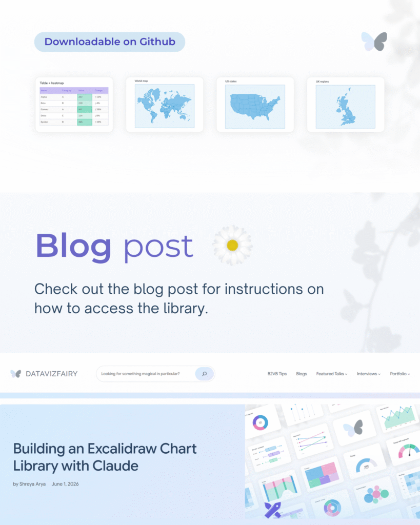
How to download and use the chart library 📖✨
I’ve submitted the library to Excalidraw’s library portal and am waiting for it to be approved. For now, you can download it through my GitHub and import it into Excalidraw using the steps below.
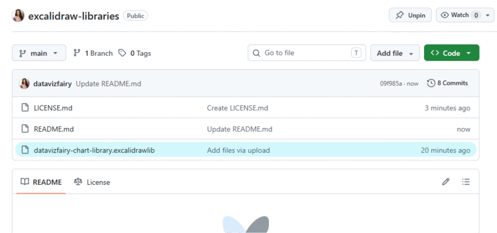
Step 1: Download the Library from GitHub
Head to my GitHub repository and download the the file ‘datavizfairy-chart-library.excalidrawlib‘.
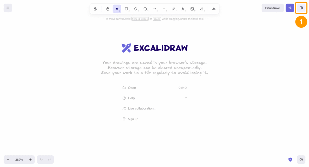
Step 2: Import it into Excalidraw.
Head to Exalidraw and click on the library icon in the corner in the top right corner.
This will open up the Library panel. From here click on the 3 dots (…) in the corner, then click on the dropdown option “Open“.
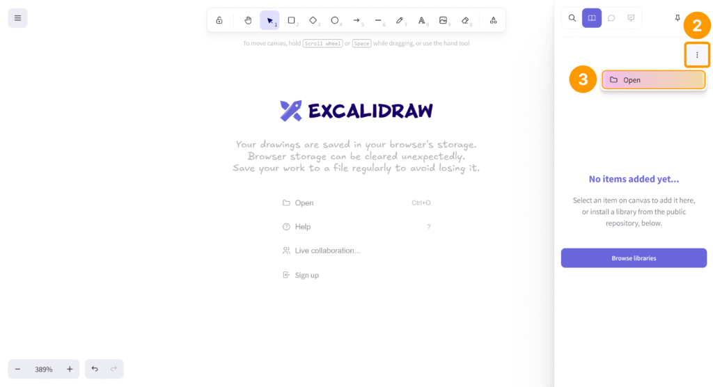
Select the ‘datavizfairy-chart-library.excalidrawlib‘ file you downloaded earlier and press OK.
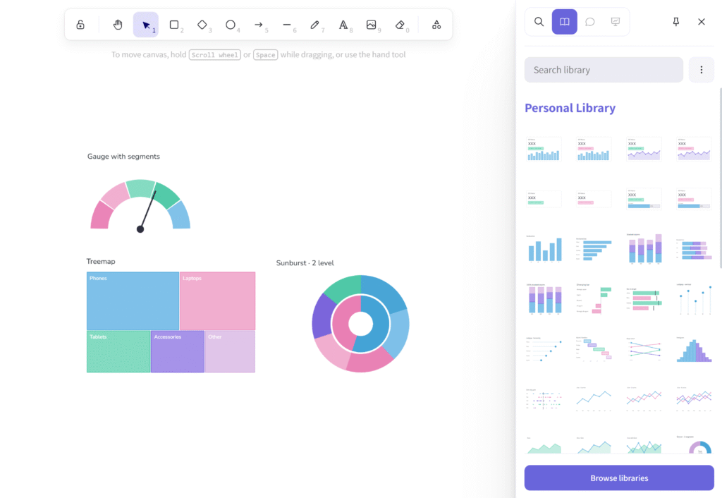
The chart library should now appear for you! ✨ You should only need to import it in once, unless you reset the library.
3.
How I built the library with Claude AI 🎨
.excalidraw file structure
If you’ve worked on a wireframe in Excalidraw and want to save it for later, you can save your workspace locally as a .excalidraw file. This means you can clear your canvas, start another project, and reopen the original wireframe in the browser whenever you need it again.
When I opened the .excalidraw file in a text editor, I noticed it was stored in JSON format. The shapes, colours, positions and coordinates were all written into the file, and the Line and Draw shapes specifically had coordinates that felt quite similar to creating SVGs.
That’s when I realised it was worth exploring whether Claude could help me understand the structure and generate more chart components in the same style.
{
  "type": "excalidraw",
  "version": 2,
  "source": "https://excalidraw.com",
  "elements": [
    {
      "id": "9sXlIGwG-fL8OgI4W2bPH",
      "type": "line",
      "x": 797.9086689611394,
      "y": 227.7779969978307,
      "width": 304,
      "height": 291.8095245361328,
      "angle": 0,
      "strokeColor": "#6741d9",
      "backgroundColor": "#eebefa",
      "fillStyle": "solid",
      "strokeWidth": 2,
      "strokeStyle": "solid",
      "roughness": 1,
      "opacity": 100,
      "groupIds": [],
      "frameId": null,
      "index": "a0",
      "roundness": {
        "type": 2
      },
      "seed": 1449838777,
      "version": 1379,
      "versionNonce": 248182905,
      "isDeleted": false,
      "boundElements": [],
      "updated": 1780267255495,
      "link": null,
      "locked": false,
      "points": [
        [0, 0],
        [-10.6666259765625, -21.33331298828125],
        [-29.71429443359375, -50.285736083984375],
        [-63.238037109375, -67.047607421875],
        [-108.1904296875, -70.09524536132812],
        [-129.52374267578125, -38.095245361328125],
        [-118.09521484375, 0.761932373046875],
        [-83.8094482421875, 25.14288330078125],
        [-25.142822265625, 35.047607421875],
        [-79.238037109375, 44.190460205078125],
        [-121.142822265625, 61.714263916015625],
        [-136.38092041015625, 111.23812866210938],
        [-100.57135009765625, 137.90478515625],
        [-50.28558349609375, 124.19046020507812],
        [0, 67.047607421875],
        [-11.42852783203125, 103.61907958984375],
        [-13.71429443359375, 144.76193237304688],
        [12.19049072265625, 188.19046020507812],
        [59.4287109375, 173.71432495117188],
        [73.90478515625, 131.047607421875],
        [59.4287109375, 94.47616577148438],
        [30.4761962890625, 61.714263916015625],
        [45.71441650390625, 63.238128662109375],
        [80.0001220703125, 81.5238037109375],
        [133.33343505859375, 90.66665649414062],
        [167.61907958984375, 57.14288330078125],
        [156.952392578125, 9.14288330078125],
        [99.0477294921875, -0.76190185546875],
        [46.4761962890625, 32.761932373046875],
        [53.3333740234375, 12.952392578125],
        [92.952392578125, -14.4761962890625],
        [114.28570556640625, -57.14286804199219],
        [87.61907958984375, -103.61906433105469],
        [36.57147216796875, -91.42855834960938],
        [14.4761962890625, -64.76191711425781],
        [5.3333740234375, -16.76190185546875],
        [0, 0]
      ],
      "startBinding": null,
      "endBinding": null,
      "startArrowhead": null,
      "endArrowhead": null,
      "polygon": true
    }
  ],
  "appState": {
    "gridSize": 20,
    "gridStep": 5,
    "gridModeEnabled": false,
    "viewBackgroundColor": "#ffffff",
    "lockedMultiSelections": {}
  },
  "files": {}
}
Exploring possibilities with Claude
I used the Sonnet 4.6 model throughout. To begin, I shared some charts I had already made myself in Excalidraw, alongside the code from the file, so Claude could understand both the structure and the visual style I wanted to keep.
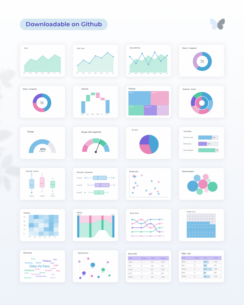
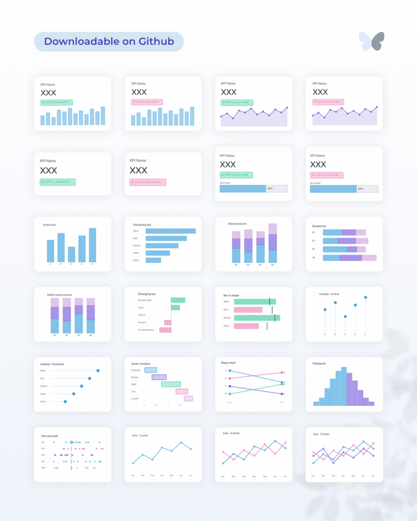
I then asked it to create a few chart types to test with, more specifically: a bar chart, line chart, donut chart, scatterplot, stacked bar, box plot and Sankey.
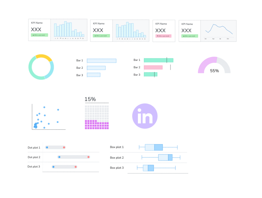
It took a few iterations and some guiding to get the charts outputting correctly. The earlier versions were close, but needed refining so they looked like polished Excalidraw charts, rather than rough generated shapes. There were also some technical bits to fix, like making sure polygons closed properly, lines connected as expected, and everything imported back into Excalidraw cleanly.
With each version, Claude seemed to build a better understanding of both the Excalidraw format and the visual style I was trying to create.
The maps specifically were trickier, as they needed more complex polygon shapes. Based on the code, I realised that providing SVG files would help Claude understand the structure much better, rather than relying on a written description alone.
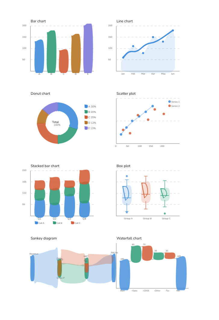
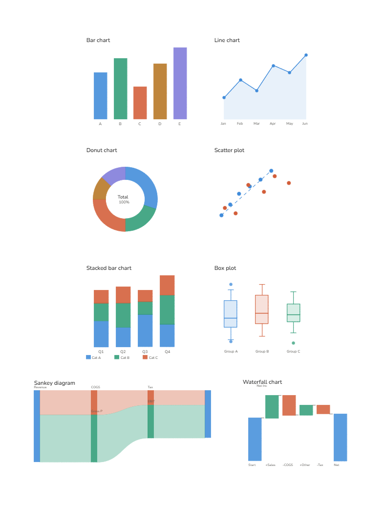
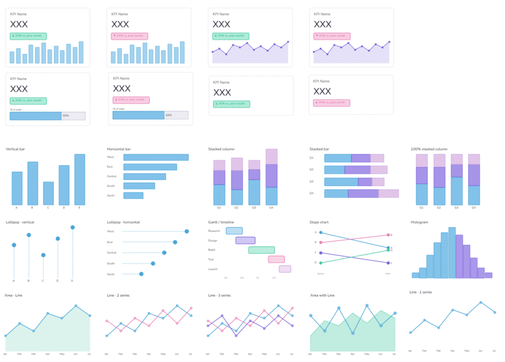
Iterating the build of the first 8 charts
And with that, I was able to take a project I’ve really wanted to complete, but knew would be time-consuming, and optimise the building process with Claude.
What could have taken weeks, if not months, was created in just a day!
The main benefit is having a more polished chart library to work with, which will save time in my day to day and make the wireframing process much quicker. Instead of manually redrawing chart shapes each time, I can use the library to move from an idea to a clear wireframe much faster.
Why did I make my own library of charts?
The reason I wanted to make my own is because the current libraries I found didn’t have certain charts I wanted to use, or their visual style wasn’t cohesive with my own way of wireframing.
Considering how often I wireframe and build charts from scratch, I realised this would be a good opportunity to optimise the early stage of my dashboard design process. Having my own chart library means I can turn ideas into something visual much faster, and use those early wireframes to have better conversations before moving into the build.
Instead of spending time manually creating the same chart shapes, I can focus more on the direction of the dashboard, how the story should flow, and what needs to be clarified before development starts.
And by making it publicly available, hopefully others can benefit from it too!
Final thoughts 💧
For me, this was a really interesting use case of where AI can help optimise ways of working. Claude helped turn a slow manual process into something much faster and more repeatable, while still keeping the final library aligned with the style I wanted.
Hopefully it helps you with your own wireframing too, and if you have any suggestions for chart types to add, let me know!
I’d love to see how this library is used by others, so if you try it out in your own wireframing, feel free to tag me @datavizfairy on Twitter or Shreya Arya on LinkedIn ✨