Category: B2VB
-
Build a better SANKEY
Sankey charts effectively display the flow of data between stages, highlighting key relationships. Here are 11 TIPS to help you get started!
-

Build a better LANDING PAGE
Landing pages enhance user experience by providing clear navigation and vital data. Here are 12 TIPS to help you get started! 💜
-
Build a better UNIT CHART
Unit charts use icons to display data points, offering an engaging and straightforward way to compare data. Here are 8 TIPS to help you get started!
-

Build a better BOX PLOT
Box plots provide a clear visual summary of data ranges, medians, and outliers. Here are 11 TIPS to help you get started!
-
Using ANNOTATIONS
Slides
-
Using COLOUR
Strategic use of colour can elevate key data points, enhancing clarity and facilitating quicker comprehension. Here are 8 TIPS to help you get started!
-
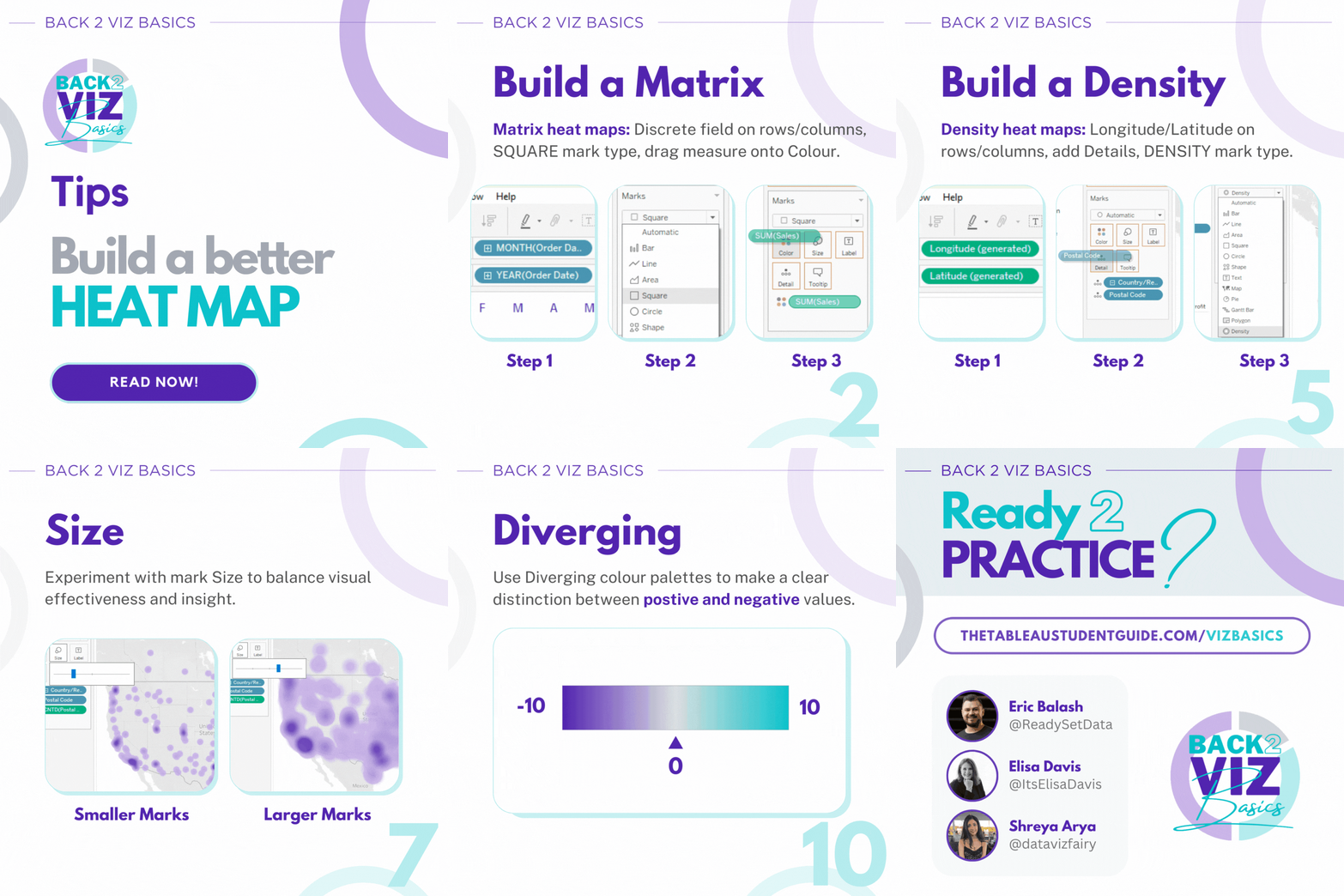
Build a better HEATMAP
Heat Maps use colour to highlight patterns within data, enabling quick insights. Here are 11 TIPS to help you get started!
-
Format & Layout
A clear and well-designed Dashboard layout makes data easier to understand and act upon. Here are 12 TIPS to help you get started!
-
Build a better MAP
Ready to build better Maps? Here are 10 TIPS to help you get started!
-
Build a better BAN / KPI
BANs and KPIs play a significant role in quick decision-making, offering valuable insights into key business metrics. Here are 9 TIPS to help you get started!