Oh to be inspired…
I’m so happy to finally share my RWFD Call Center dashboard with you all! I had been working on this dashboard for a while, as it consits of 4 individual dashboard views. It’s always so satisfying and rewarding when you complete a project 🧚🏼♀️✨
I also wanted to give a big thank you to everyone who inspired me while creating this dashboard. Inspiration can go a long way… so here’s more about how these amazing people inspired me, in hopes that they can inspire you too! 💫
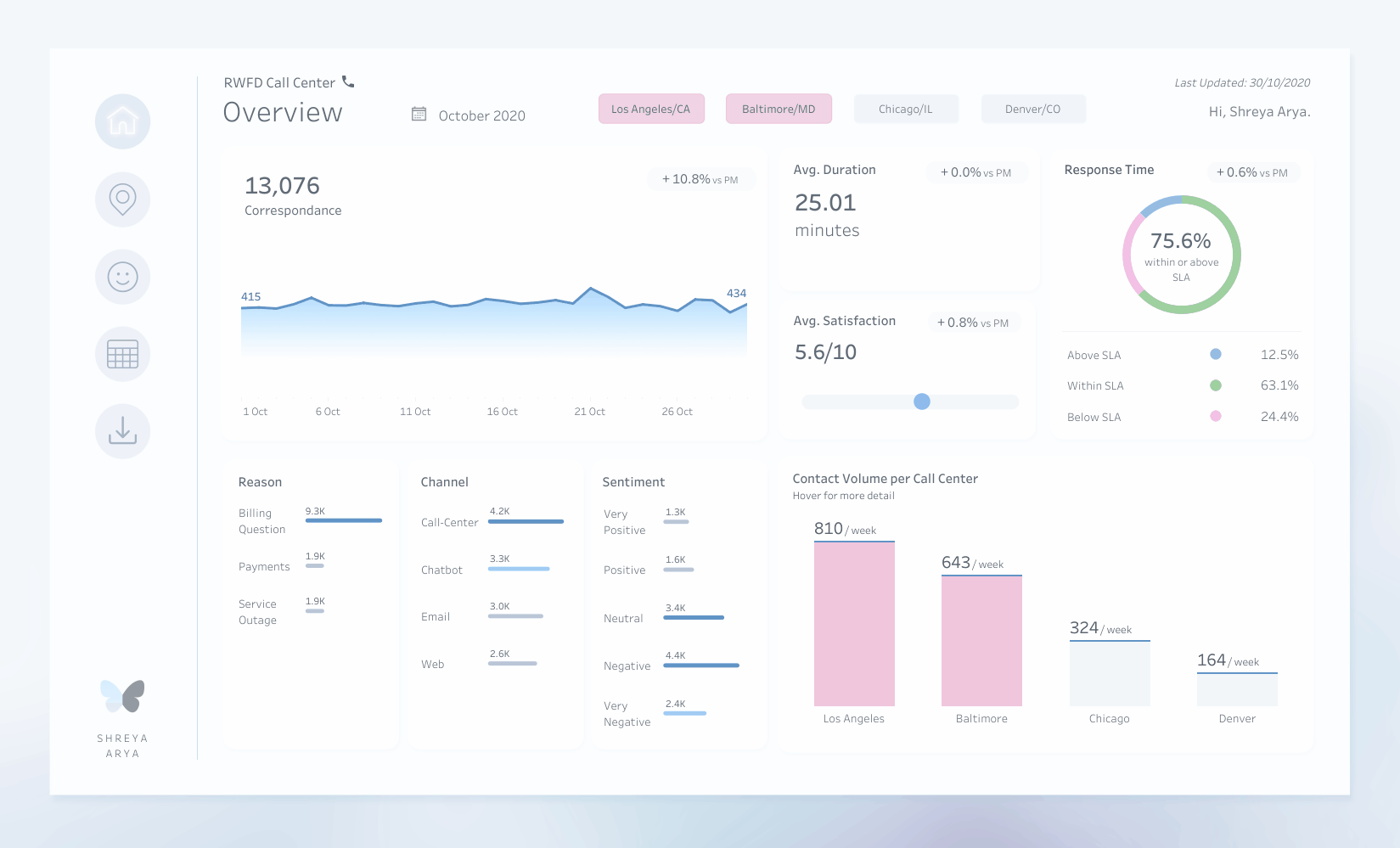
View my Call Center Dashboard | #RWFD on Tableau Public
Kizley Benedict
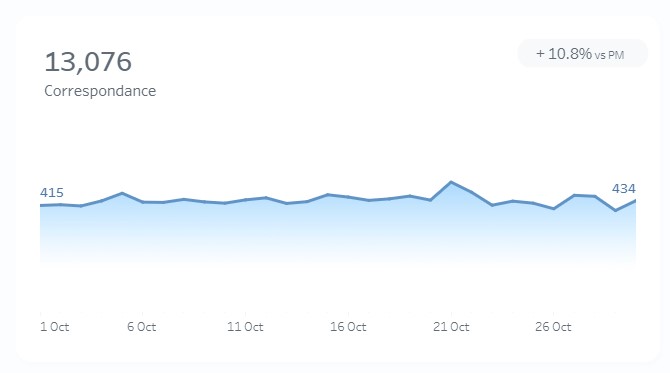
I came across Kizley Benedict’s post on How to create a Gradient Area Chart in Tableau, from when he guest authored on The Flerlage Twins blog, and couldn’t wait to try it out! It’s such a clear and easy tutorial to follow along with. You can see my recreation of a Gradient Area Chart on the Overview page of my dashboard. He also has so many beautiful dashboards on his Tableau Public profile!

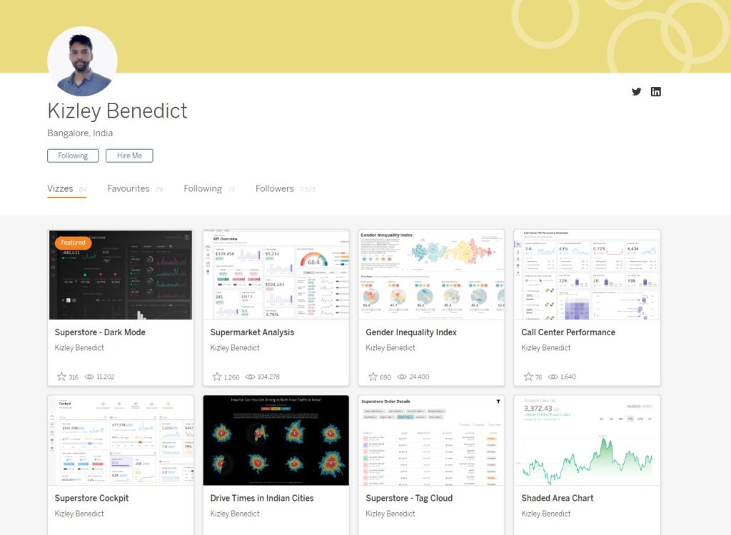
Follow Kizley Benedict:
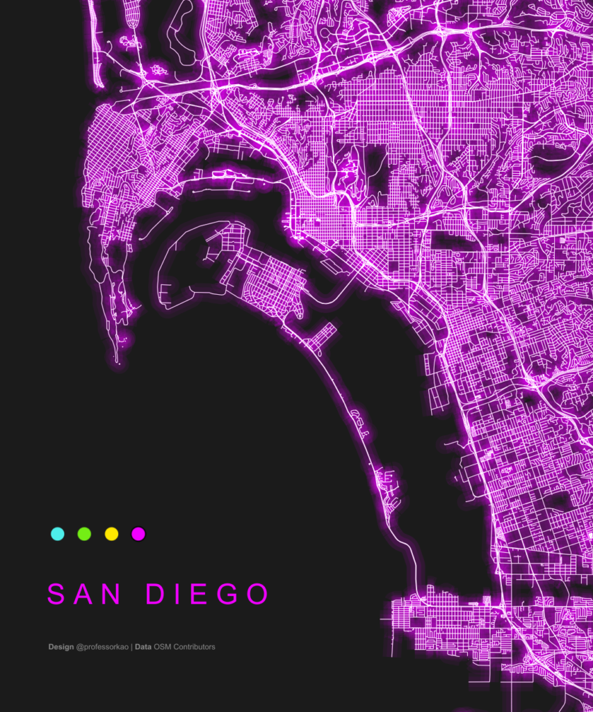
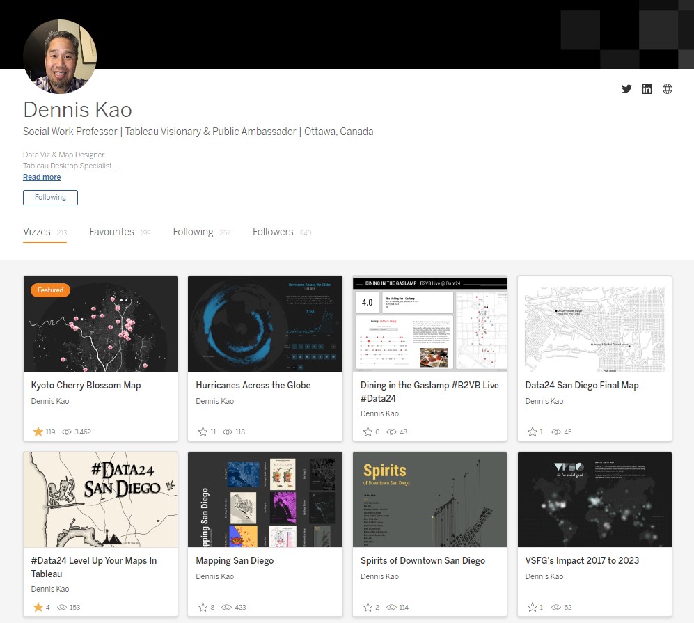
Dennis Kao
You may have noticed that the navigation buttons on my dashboard have a subtle glow when selected 🌟 I was inspired to try this out after seeing so many beautiful dashboard by Dennis incorporating a beautiful glow effect! Here are some examples of his work, along with my inspired navigation buttons. Dennis is definitely one of my go-to’s for design and map inspiration!

Follow Dennis Kao:
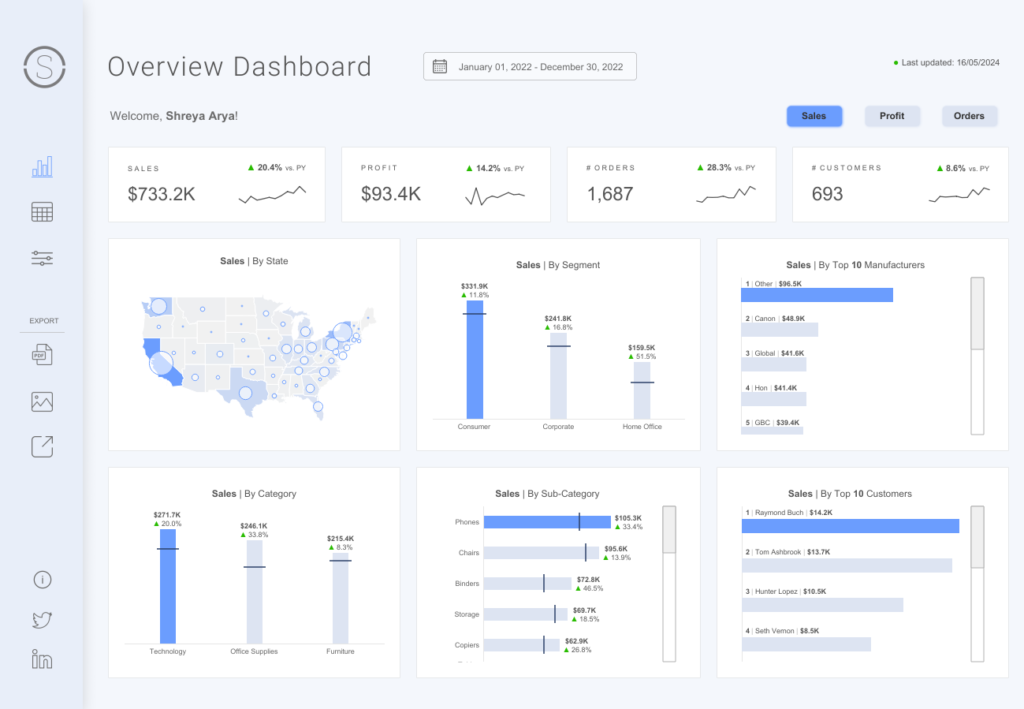
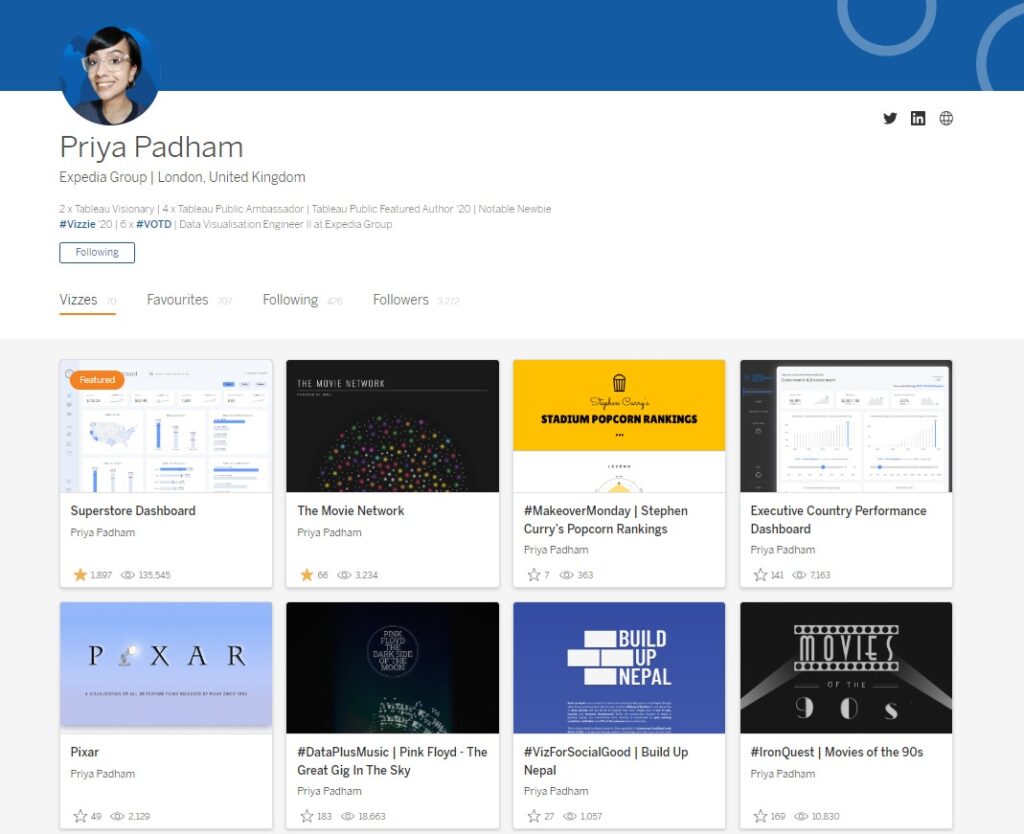
Priya Padham
I was so very inspired by Priya Padham’s iconic Superstore Dashboard, and her talk at this year’s Tableau Conference, where she discussed the effectiveness of simple visuals and minimalistic design – definitely a talk worth watching if you haven’t already!
I love how pretty and elegant her designs are, and this dashboard is no exception! Her Sales, Profit and Order button styles inspired the design of the call center buttons on my dashboard.
Follow Priya Padham:
Jess Crichard
Last but not least, this dashboard was hugely inspired by my Manager at Lloyds Banking Group! Her amazing tips, advice and feedback on my dashboard were invaluable! I’ve definitely picked up quite a few tricks from her in terms of dashboard design, so hopefully more business dashboards will be coming soon to my Tableau Public! 😉
Follow Jess Crichard:
This was a fun project as it allowed me to try out and experiment with some new visuals, thanks to Mark Bradborne and Jacqui Moore for running the Real World Fake Data project!
You can find out more about Real World Fake Data (RWFD) here: https://domoorewithdata.com/home/real-world-fake-data/