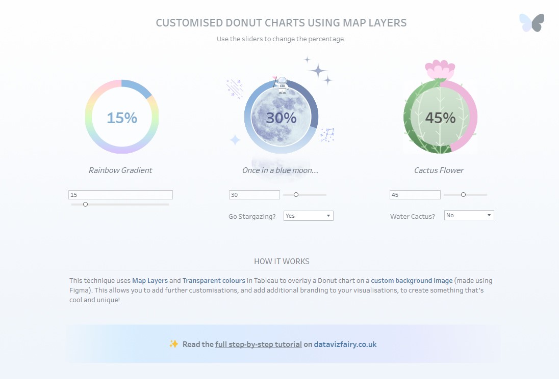
Customised Donut Chart
In my recent Makeover Monday submission, I designed my donut charts to look like an engagement ring. My goal was to try and make this ring look as realistic as possible, and I was really pleased with the outcome! 💍
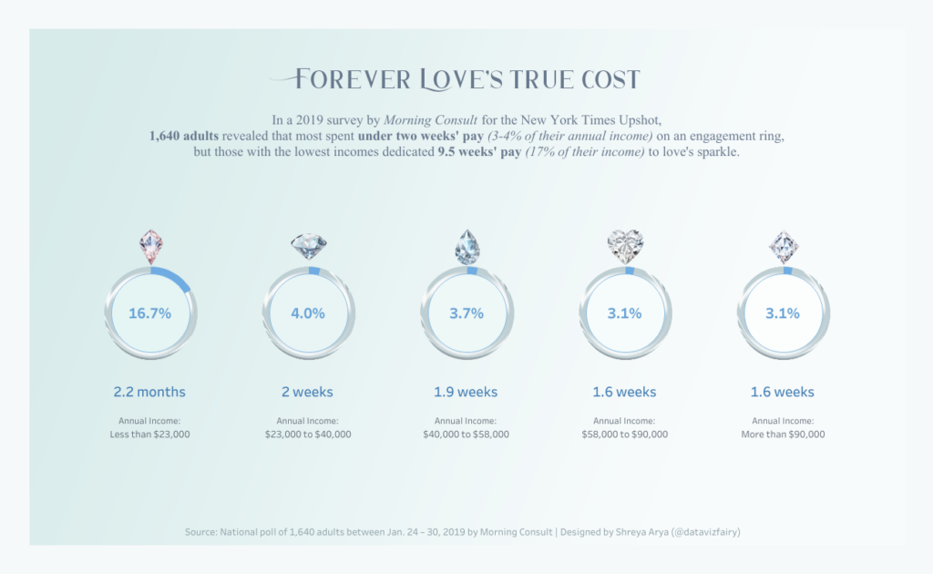
Forever Love’s True Cost | View on Tableau Public
In today’s post, I’ll be teaching you how to create a more customised Donut chart in Tableau Desktop. This technique will allow you to incorporate gradients, patterns, and more ✨ into your donut charts, to create a more engaging viz!
Here’s how…
Step 1: Head to Figma!
Start by heading to figma.com, and create / log into your account.
✨ Note: Figma is free to use, however you will need to create an account.
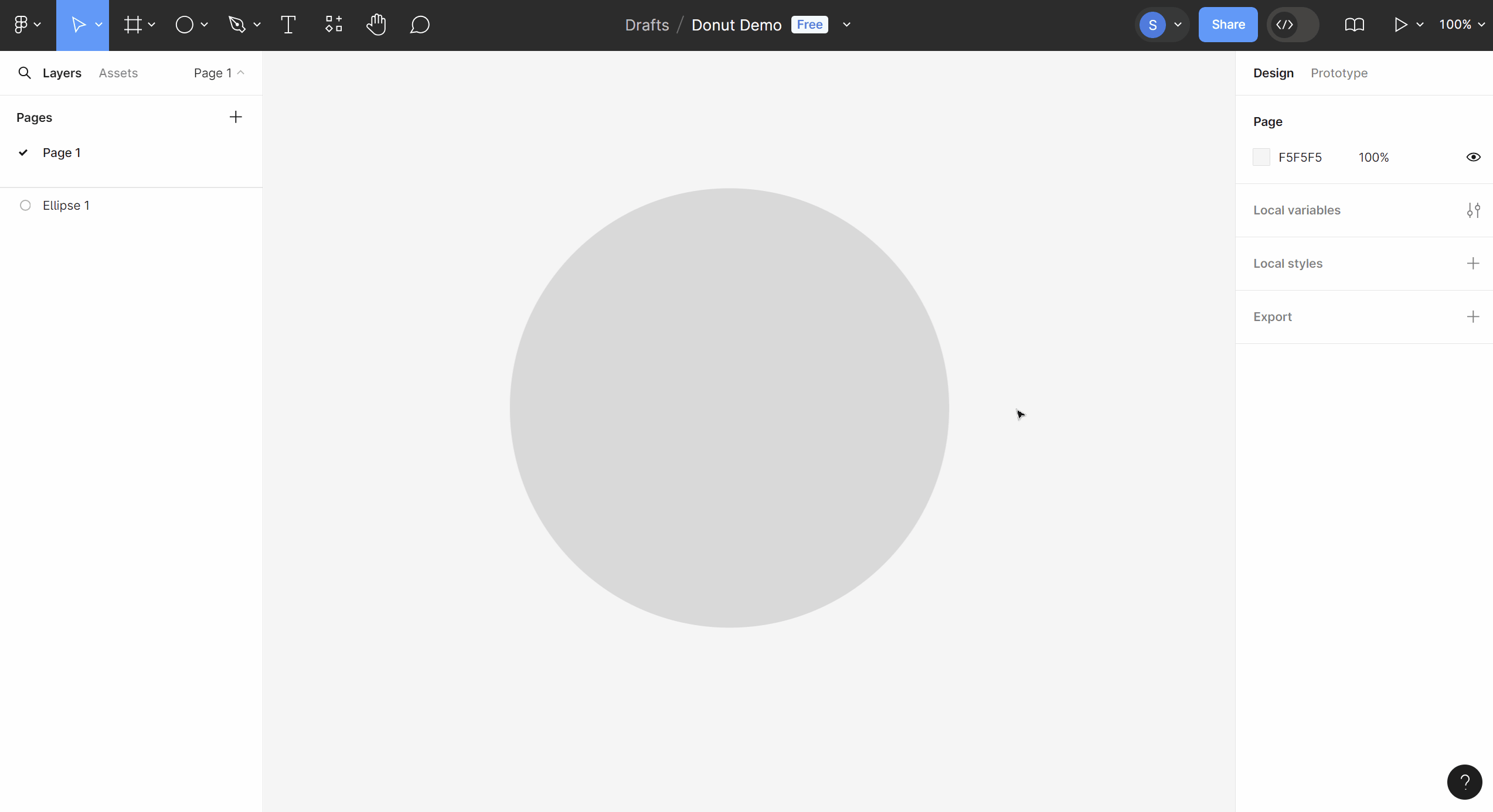
Step 2: Create a Donut Background
In a new design file, let’s create the background circle for our donut!
Select the Ellipse shape tool, and click on the canvas. Change the width and height of the circle – it can be of any size, but it must have the same height and width proportions. I’ve made mine 400px × 400px.
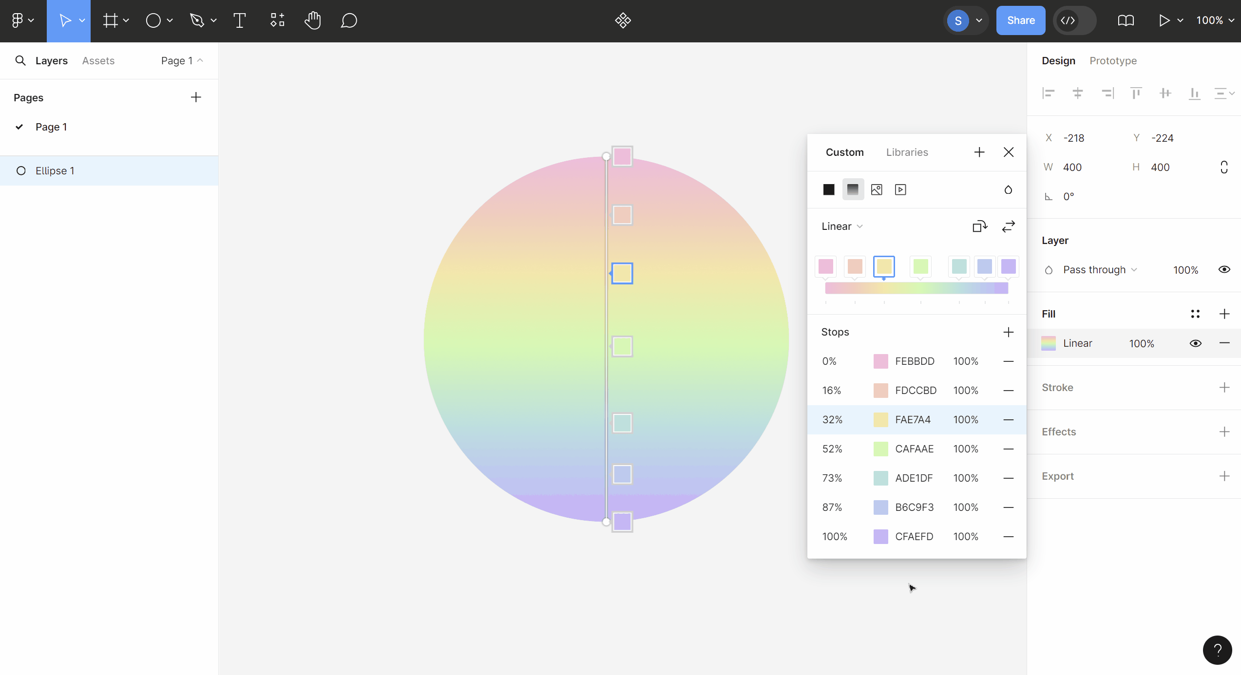
Click on the circle, and add your chosen gradient or pattern to the shape. I’ll be adding a rainbow gradient in my example.
When you’re happy with your donut background, export the shape as a .PNG.
Step 3: Head to Tableau
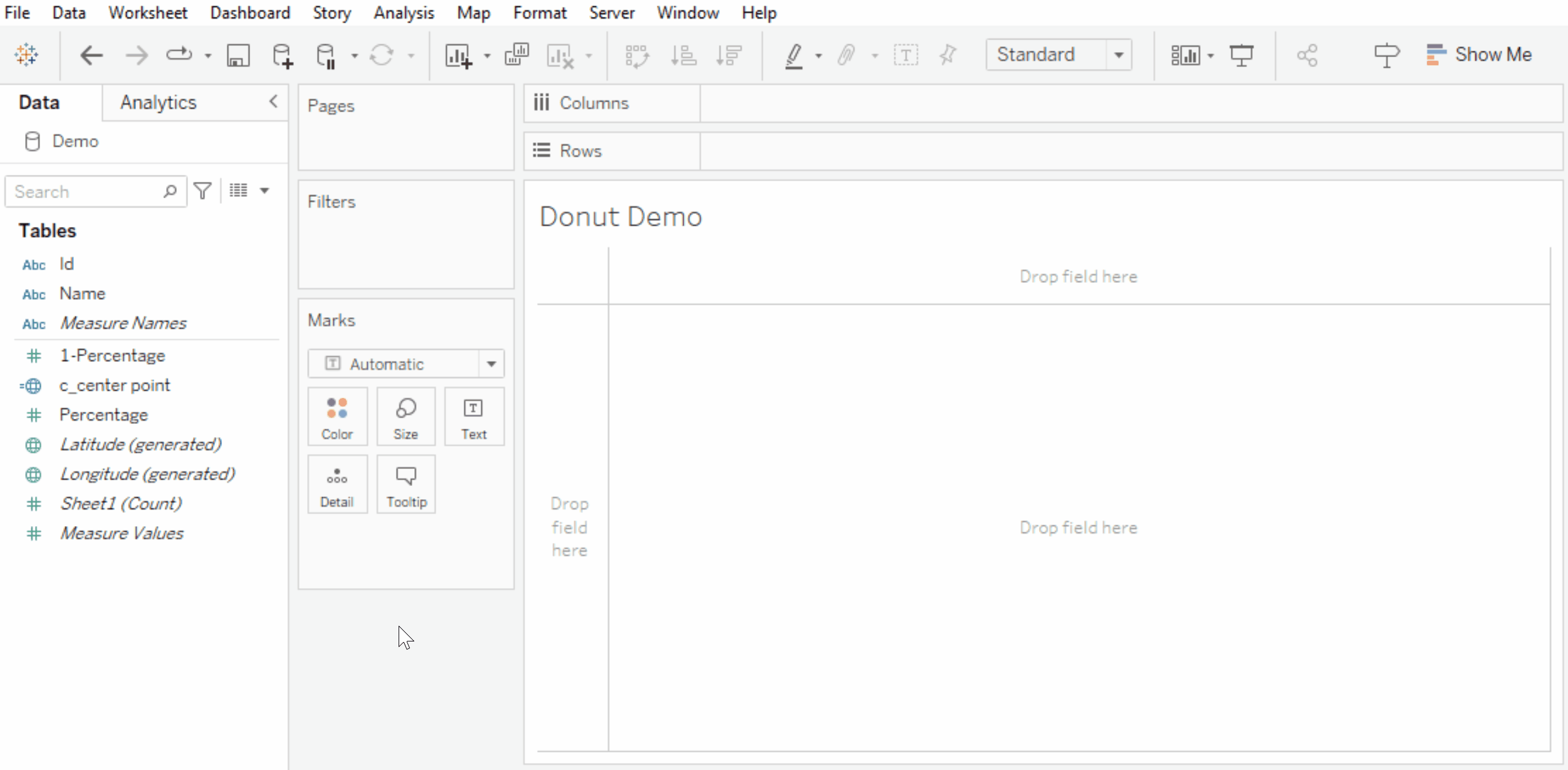
Open up Tableau Desktop, and connect to your data. Navigate to a new worksheet.
Create the following calculated fields: c_center point and c_1-percentage.
c_center point
MAKEPOINT(0,0)c_1-percentage | Subtract your Percentage field from 1 so we can get the other half of the donut.
1-[Percentage]Now, let’s create our map!
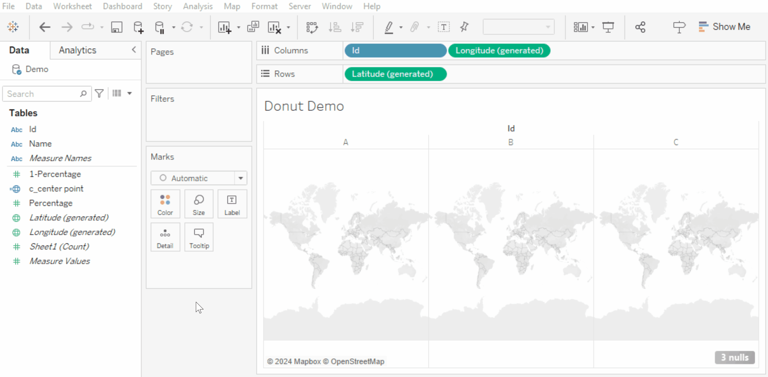
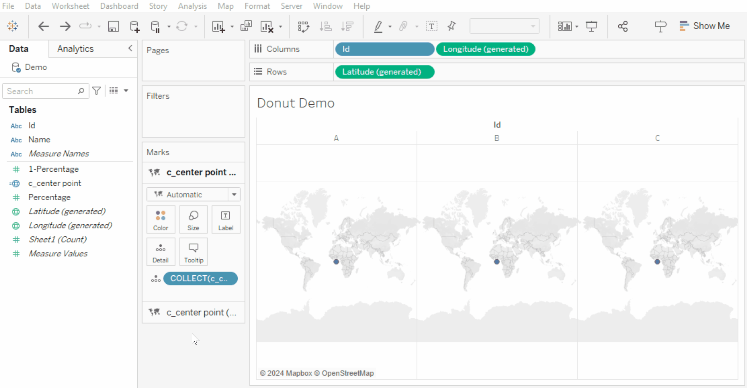
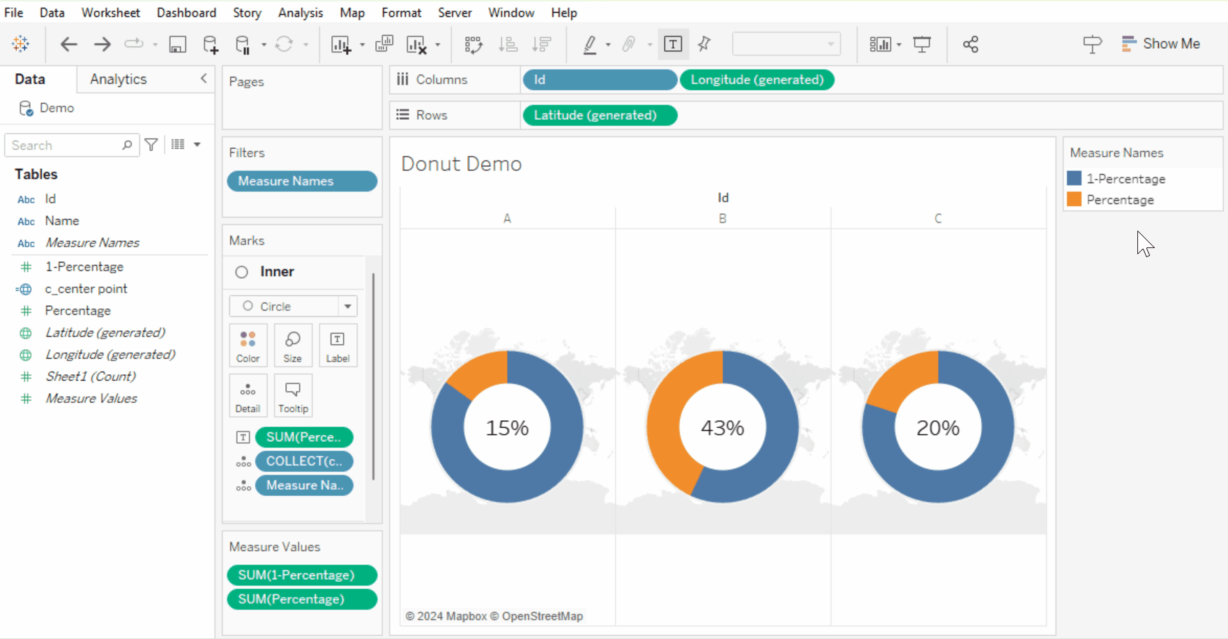
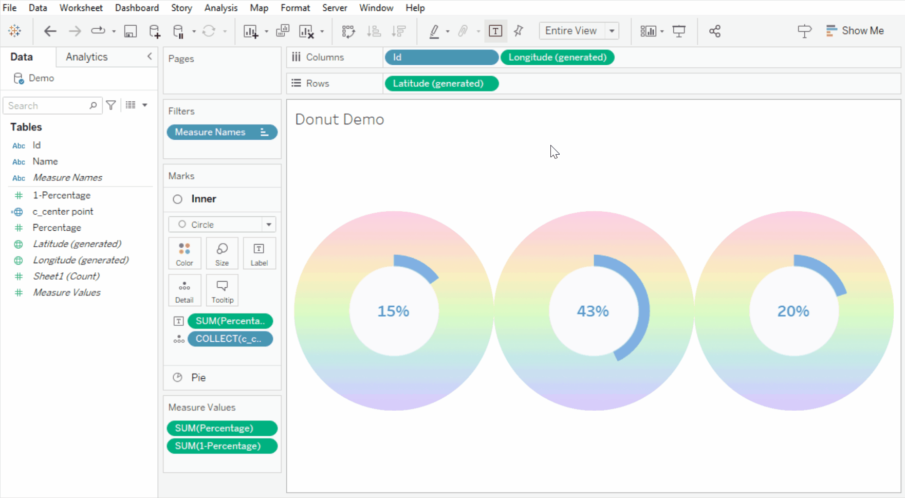
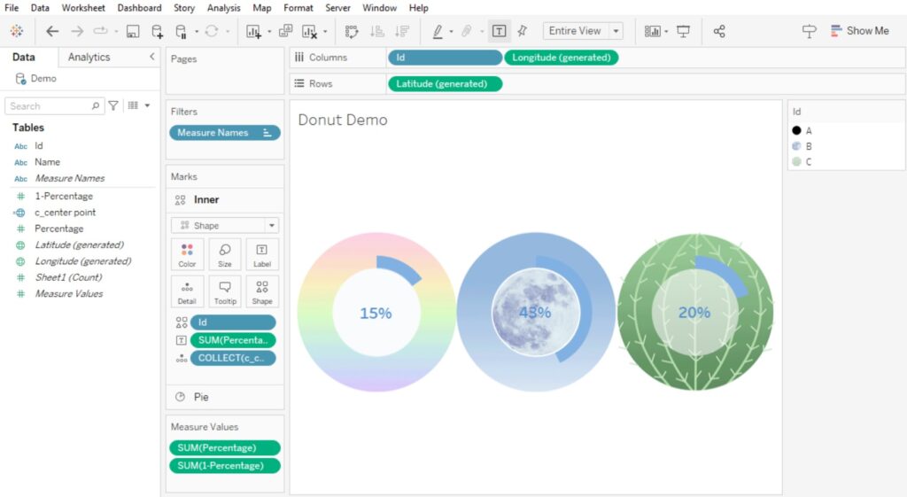
Double click on the Latitude (generated) and Longitude (generated) fields, to bring them up to Columns and Rows. This has created our Map.
If you would like to build several donuts on one sheet, place a discrete field before Longitude (generated).
I’m using the discrete field Id to create 3 donuts.
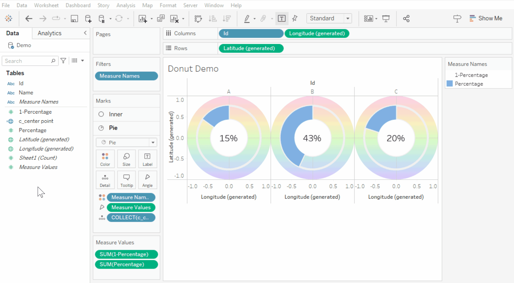
Step 4: Build your Donut
To build our donut, we’ll be using the c_center point field twice.
First place c_center point onto detail. Then drag a second c_center point onto the map and drop it onto + Add a Marks Layer.
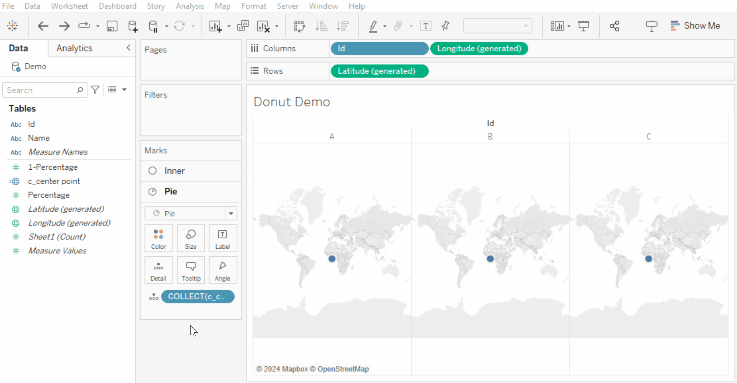
Now we have two c_center point marks in our Marks card.
Turn the upper c_center point mark into a Circle – this makes our Inner Donut – and the bottom mark into a Pie.
Increase the size of both marks, setting the Pie to max size, while making the Inner circle slightly smaller than the Pie.
Change the Inner circle’s colour to white.
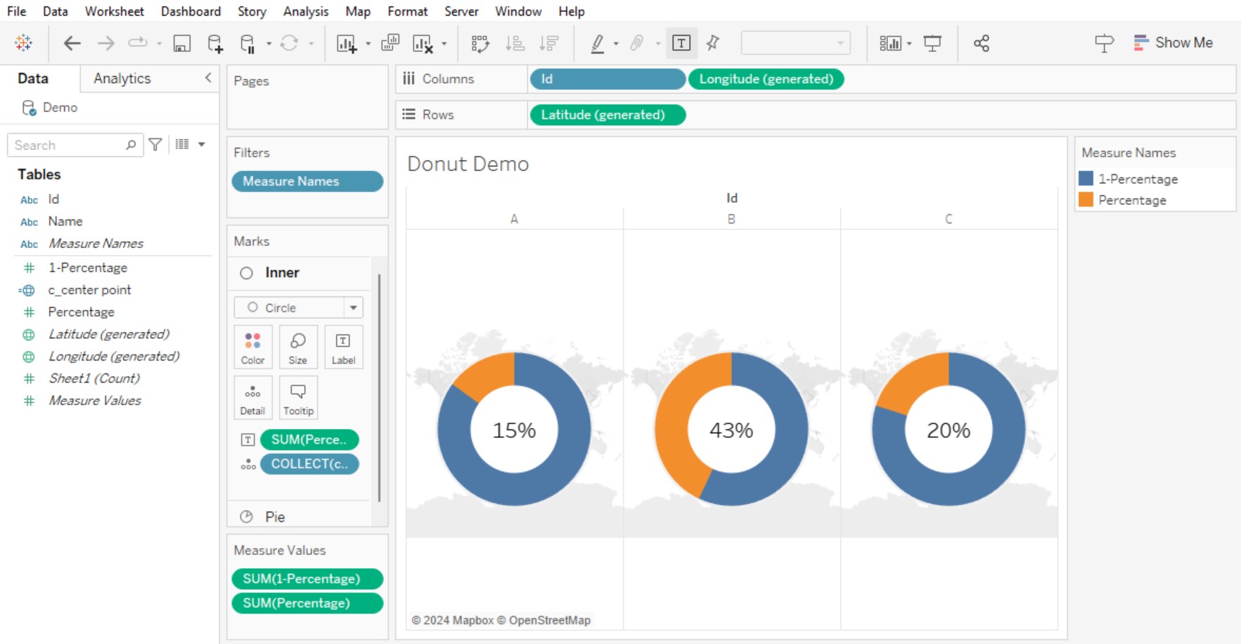
Next, drag Measure Names onto Filters. Select your Percentage and c_1-percentage fields only.
On your Pie Mark, place Measure Names onto Colour and Measure Values onto Angle.
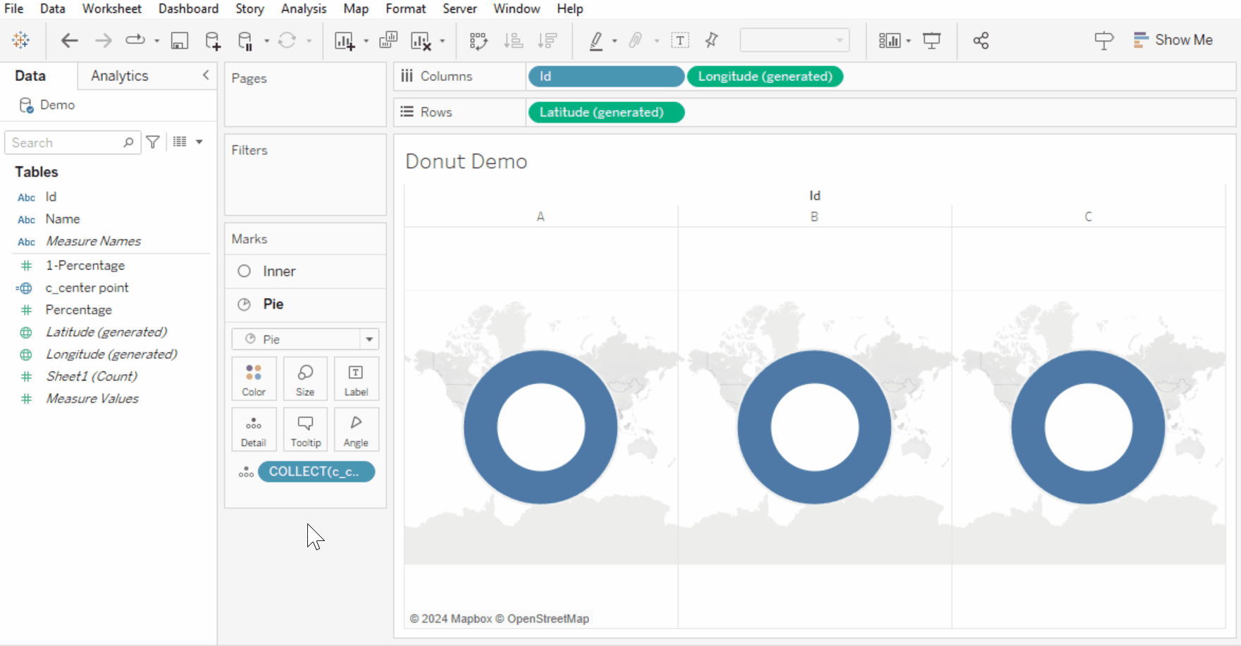
Finally, add in some percentage Labels to your Inner Circle mark, and align them Center. With that, we’ve built the foundation of our customised donut.
Step 5: Add in your background (Map Image)
This is my favourite step!
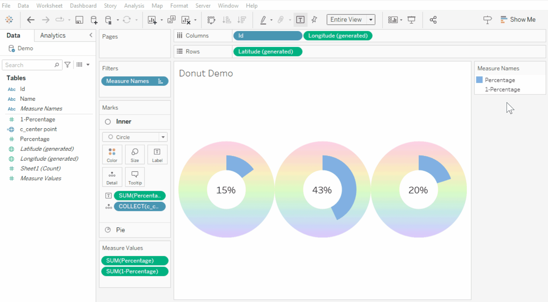
Start by removing the background map. To do this, head to Map on the top navigation bar > Background Maps > None.
To add in our custom donut background, head to Map on the top navigation bar > Background Images > [Select your Data Source] > Add Image.
You can name this Image whatever you’d like – I’ve called mine “Rainbow Gradient”. Import in your PNG image from Step 1.
Set the X Field as Longitude (generated) | Left: -1, Right: 1.
Set the Y Field as Latitude (generated) | Bottom: -1, Top: 1
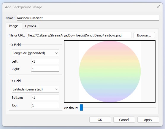
Press OK.
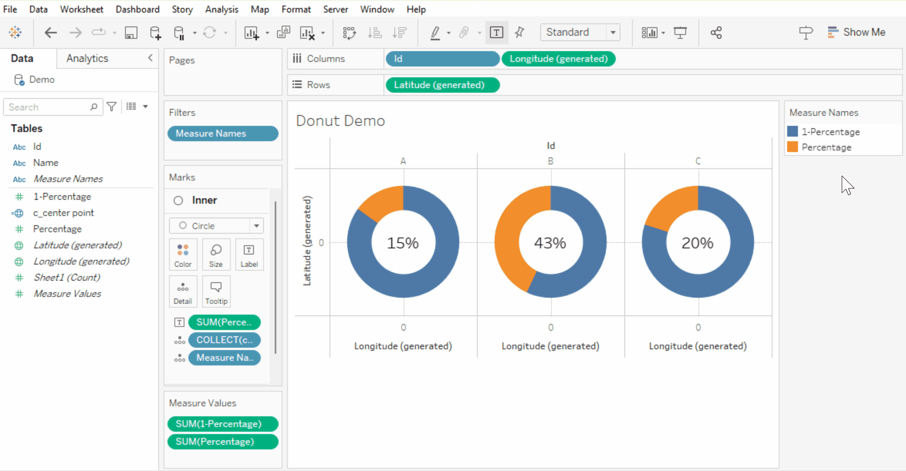
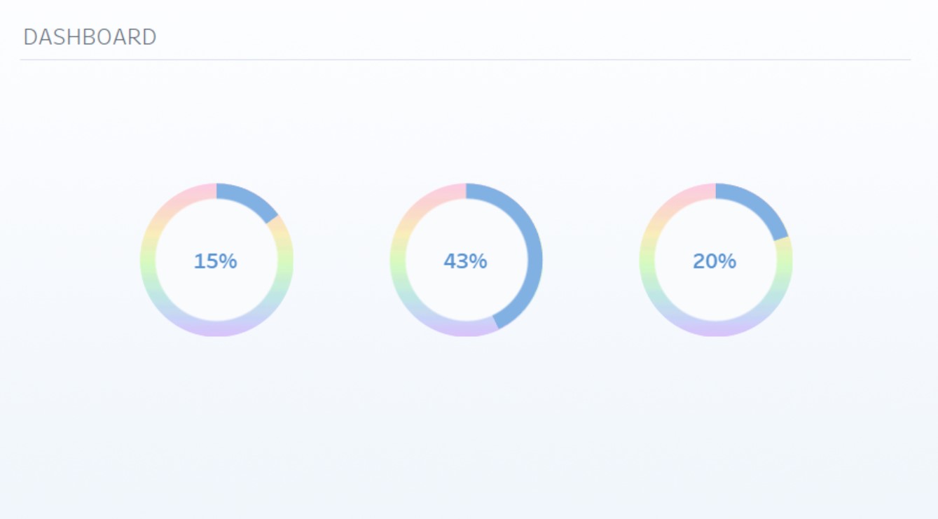
And this is what your chart should look like now.
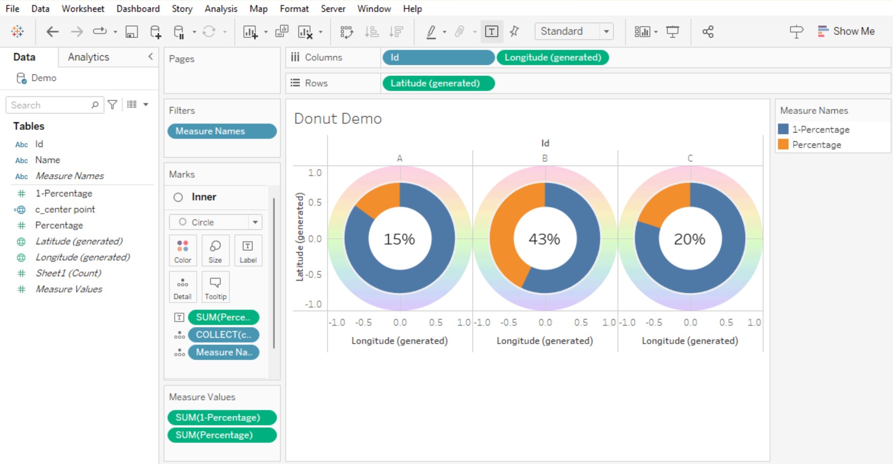
✨ Note: It will look slightly crazy at this point, but trust the process…
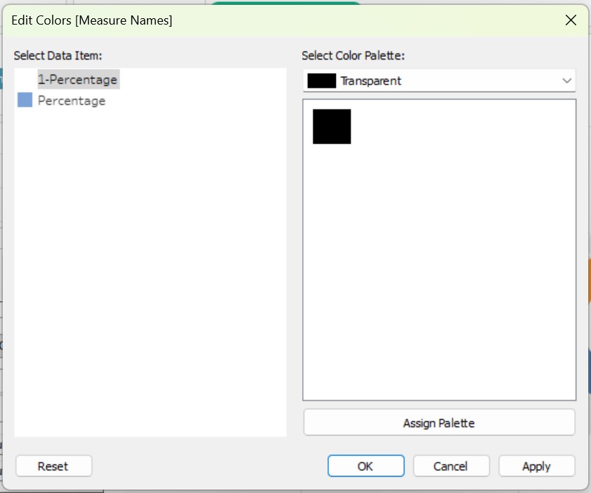
Lastly, we will want to apply a transparent colour to our c_1-percentage Field. To do this, you will need to edit your Preferences.tps file and add this specific hex code.
Here’s a step-by step tutorial on how to do this:
Remember to save your work so you can come back to the next step!
Edit the colours of your Pie Chart – set the percentage field as your preferred colour, and your c_1-percentage as the Transparent Colour, so your background shines through.
Turn off “Halo” settings for both your Inner Circle and Pie by clicking on the colour mark, and setting Halo from Automatic to None.
So the Donut percentage colour goes clockwise, drag Percentage above 1-Percentage in the colour legend.
And finally, hide all headers and axis.
Remove gridlines and set your worksheet fit to “Entire View”.
Hide the View Toolbar.
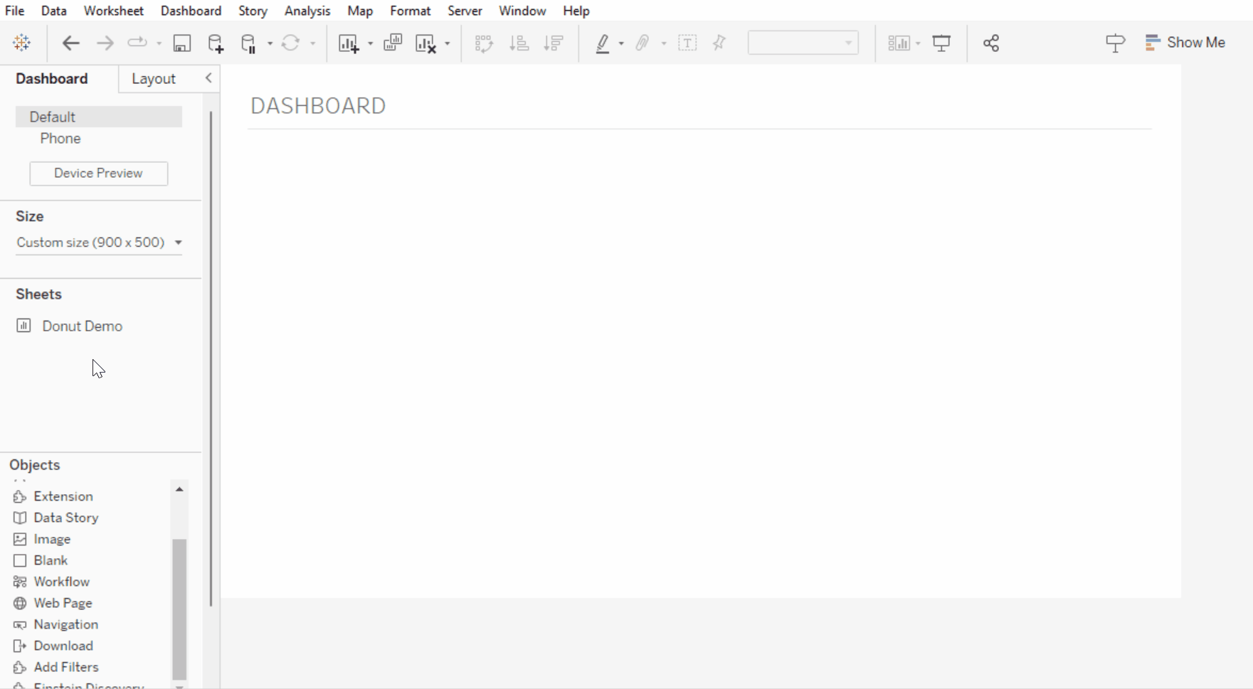
Step 6: Place onto a Dashboard + make adjustments
Navigate to a dashboard view.
Add your Donuts to the view as a floating chart and iteratively adjust the sizing until the Donut fits perfectly within the background image.
Adjusting is key to this step, as you can see in the gif below!
✨ You can fix the sheet into a container once you find your desired height / width proportions. (Optional!)
TIP: Use the Position and Size options in the Layout pane for minor tweaking!
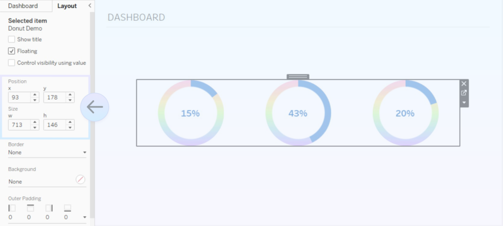
Once it looks as desired, your customised donut chart is complete! 🙂
Optional: Customise further! 🌸
You can be as creative as you’d like with Map Layers. Here are a few ways to customise your donut futher 🎨✨
Add extra layers
To add extra layers to your donuts, create MAKEPOINT() calculations, specifying the coordinates where you’d like that point to go (similar to Step 3). Add each calculation as a Mark Layer. Change the Mark type to Shape and select your Icon(s)!
To give your chart extra space for details, I would also increase the Latitude (generated) and Longitude (generated) axis ranges.
Add different donut background within the same worksheet
If you’d like to create differently styled custom donuts in one worksheet, when you add in a background image, you can specify which dimenson to associate it with.
For example – if I wanted Id “A” to be rainbow and Id’s “B” and “C” to be different images, I can head to my Background Image options and add a specific “Only Show When” rule, so that the Rainbow only shows for “A”. I can add in different background images and set similar rules for “B” and “C”.
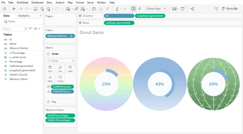
Change the inner circle to a custom shape
Instead of using a Circle mark type for the Inner circle of your donut, you can also change this to a custom shape to add extra flair!
Here’s my step by step guide on adding custom shapes to Tableau:
BLOG: The Data School – Adding Custom Shapes into Tableau Desktop
Final Thoughts
I love how creative you can be with Map Layers in Tableau! Adding customisation to your donut charts can allow you to add additional branding to your visualisations, and create something that’s cool and unique. Excited to see how everyone uses this – it’s definitely something worth experimenting with!
If you use this guide to create a Customised Donut chart, I’d love to see what you’ve come up with! Feel free to tag me @datavizfairy on Twitter or Shreya Arya on LinkedIn ✨