🌸 Blossoming, softly…
It’s finally spring and it’s so pretty seeing the blossoms in peak bloom! I’m seeing them everywhere right now and it makes me happy. We also have a cherry blossom sapling in the garden, so i’m getting my daily fill of pink blossoms 🌸🌱
An inspiring dataset 📊
To celebrate the arrival of spring, I went looking for blossom-related datasets. That’s when I came across one from the Woodland Trust, listing native British tree species and the months they typically blossom.
I didn’t realise there were so many blossom varieties. As I explored the data, I started imagining more creative ways to represent it. That led to my idea of a blossom calendar, which we’ll explore later in this blog!
Today I wanted to share some of the creative decisions that went behind the making of this viz, hopefully you find it useful to hear my thoughts behind it!

View “A spring full of british blossoms” on Tableau Public
Design notes:
Typography
Since the theme of the viz was ‘British blossoms‘, my mind instantly wanted to explore a more editorial style of viz. To match that look, I used:
• Serif fonts for the headers – these are characteristic of editorial designs.
• Sans-serif fonts for body text – these are easier to read digitally and give the design a more modern feel.
Pinterest was great for finding some editorial design inspiration.

COLOUR PALETTE
Inspired by all the blossoms around me, I’ve used pink and white tones primarily throughout the viz, with soft blue accents.
| Pink | Symbolic of pink blossoms. Pink is associated with sweetness, joy and playfulness. |
| White | Symbolic of white/cream blossoms. White is a colour of freshness, purity and innocence. |
| Soft blues | Symbolic of blossoms in the shade, taking on a duller hue. This shade adds contrast to the viz and makes it feel more dimensional. |
IMAGERY
If you’ve seen my porfolio, you’ll know that I love adding imagery to my visualisations. For this project, I designed the charts to reflect the blossom theme, but I also added extra visual elements by creating custom graphics and layering in subtle background images.
Graphics
Using Figma, I created simple blossom graphics using five overlapping circles with radial gradients from pink to white. These were placed near the title for a light, fresh feel.


Photography
I also underlayed some blossom images taken from Unsplash to subtly reinforce the blossom theme throughout the viz. I think this adds a layer of elegance and realism to the viz.

CHARTS
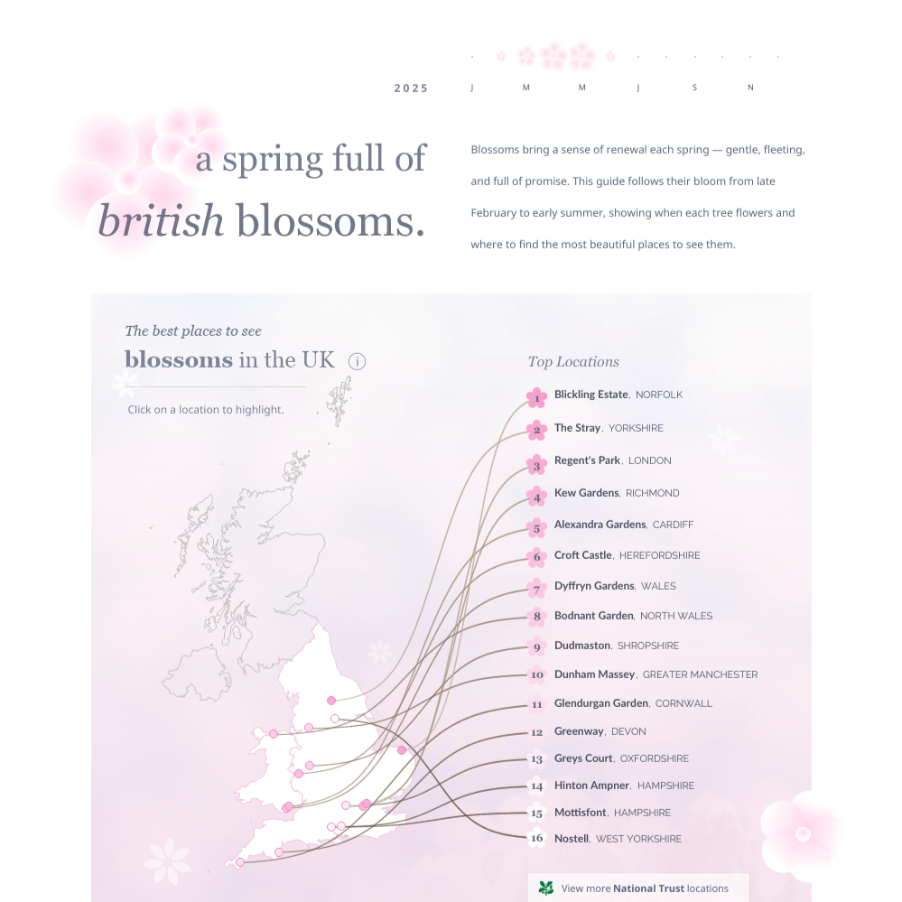
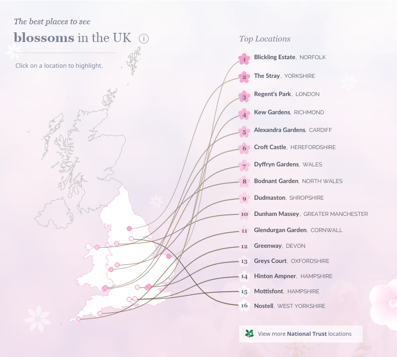
Map
When I was designing the map, I pictured each blossom location as the base of a branch, with the ranking blooming from it. Using Wendy Shija’s ‘Drawing Curves on a Map’ tutorial as a guide, I adjusted the paths so that the rankings extend naturally from the locations to their rankings. After a bit of trial and error in adjusting placement of the rankings, the map looked exactly as I pictured in my head!
🌸 Wendy Shija: Drawing Curves on a Map Tutorial
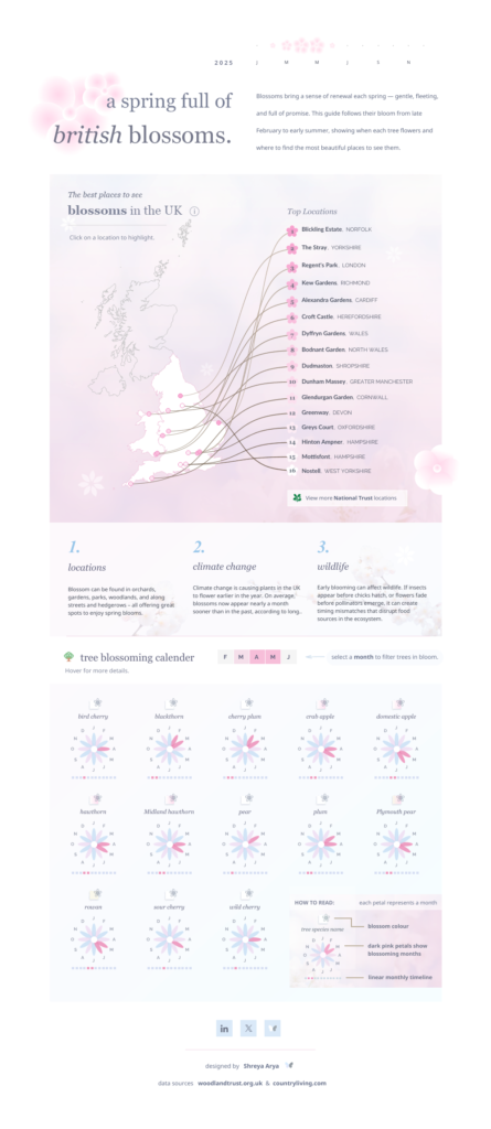
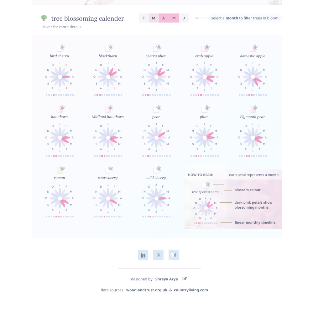
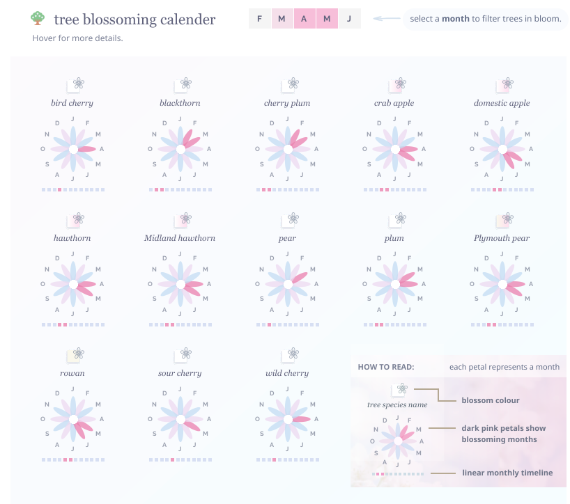
Blossom Calender
Even though this chart sits towards the end of the viz, this was the first chart I built after coming across the dataset, and it got me so excited!
To create this, I was inspired by CJ Mayes blog ‘Petals And Circles Don’t Always Make Wreaths’ back from 2021 and adapted his mock data example. If you want to see how it works, his blog goes through all the steps and calculations.
🌸 CJ Mayes: Petals And Circles Don’t Always Make Wreaths
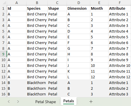
I didn’t need the circle element from his layout, so I removed that worksheet and focused on the petals. I set up twelve rows, one for each tree species, with each petal representing a month of the year.
Since this format isn’t a standard calendar, I added a linear timeline below and included a small “How to Read” guide to help make it clearer.
To break up the petals visually, I used two alternating shades for the non-blooming months. It adds a bit of depth and makes the blooming periods easier to spot.

TOOLTIPS
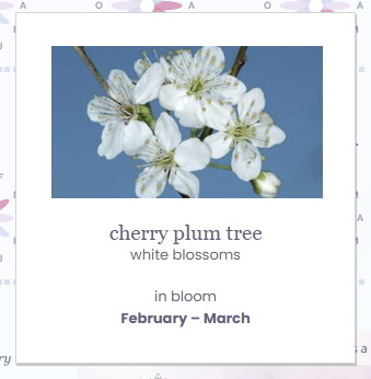
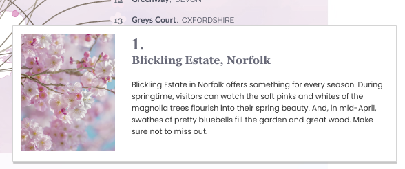
I added images within the tooltips across the viz. This included:
• Blossom photos for each species
• Location pictures where available
I think small touches like these help the viewer connect with the data and it makes the experience more immersive.
CALL TO ACTION
After all that, the viz still didn’t feel as actionable as I hoped.
I had imagined this viz working like a little guide to blossoms, for those living or planning to visit the UK. But what if the viewer isn’t near any of the locations listed?
In all honesty, there are so many beautiful places to enjoy blossom across the country. So I decided to include a button to the National Trust’s location search. It’s a lovely way to explore even more spots with scenic blossoms.
So now there’s something for everyone 🙂
A wish upon pink petals… (final thoughts)
I hope you’re enjoying the blossoms this season and that you found the viz and this blog interesting. A lot of thought usually goes into the design process, and it’s always so rewarding to see it come through in the final piece.
In other news, I’ll be at Tableau Conference next week! looking forward to meeting everyone in person! 🌸
If you found this post helpful or it sparked some ideas, I’d love to hear from you. Feel free to tag me @datavizfairy on Twitter or Shreya Arya on LinkedIn ✨