The Sun, the planets and the stars…
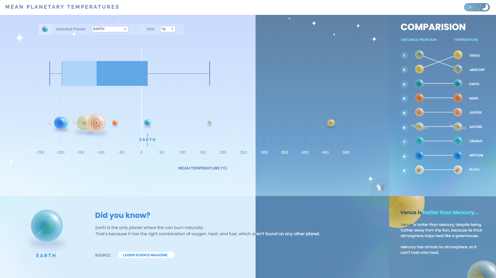
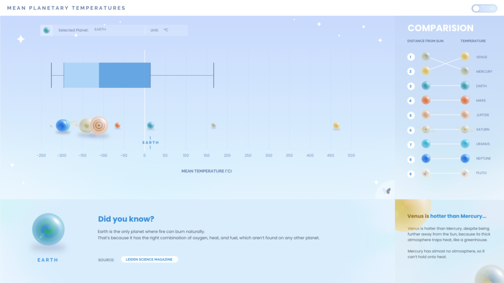
In my latest viz on Mean Planetary Temperatures (a project I started last year that had been resting in my hidden folder forest on Tableau Public for far too long…), I wanted to take this Back 2 Viz Basics challenge a step further and explore light-dark mode functionality.
Why create a Light – Dark mode? 🌕🌑
Allowing users to switch between light and dark modes is a popular UI/UX feature that enhances the user experience by offering customisation based on personal preferences or viewing conditions. It’s a simple yet powerful way to make your design more flexible and user-friendly.
Today, we’re going to explore different techniques for implementing light-dark mode functionality in Tableau Desktop.
Start with a plan!
Before going ahead and building your charts and dashboard, I think it’s a good idea to have a game plan of how you want to approach this.
So let’s explore 2 different ways you could implement this: using two dashboards or just one.
1. Two dashboards, Two modes
One of the simplest ways to create light-dark mode is by designing two separate dashboards; one in light mode and one in dark mode. You can then link the two dashboards using a navigation button styled as a toggle.
I used a very similar approach in my Harvestella dashboard, only I was switching between two towns from the game, instead of light and dark.
2. One dashboard with Dynamic Zone Visibility
If you’d like to integrate this functionality into one dashboard page, you can use Dynamic Zone Visibility to do this.
I love experiementing with dynamic zone visibility, so this is the method I chose for this viz project.
📖 If you’re new to Dynamic Zone Visibility, Tableau has a detailed guide that’s a great starting point: Use Dynamic Zone Visibility – help.tableau.com
Here’s how it works:
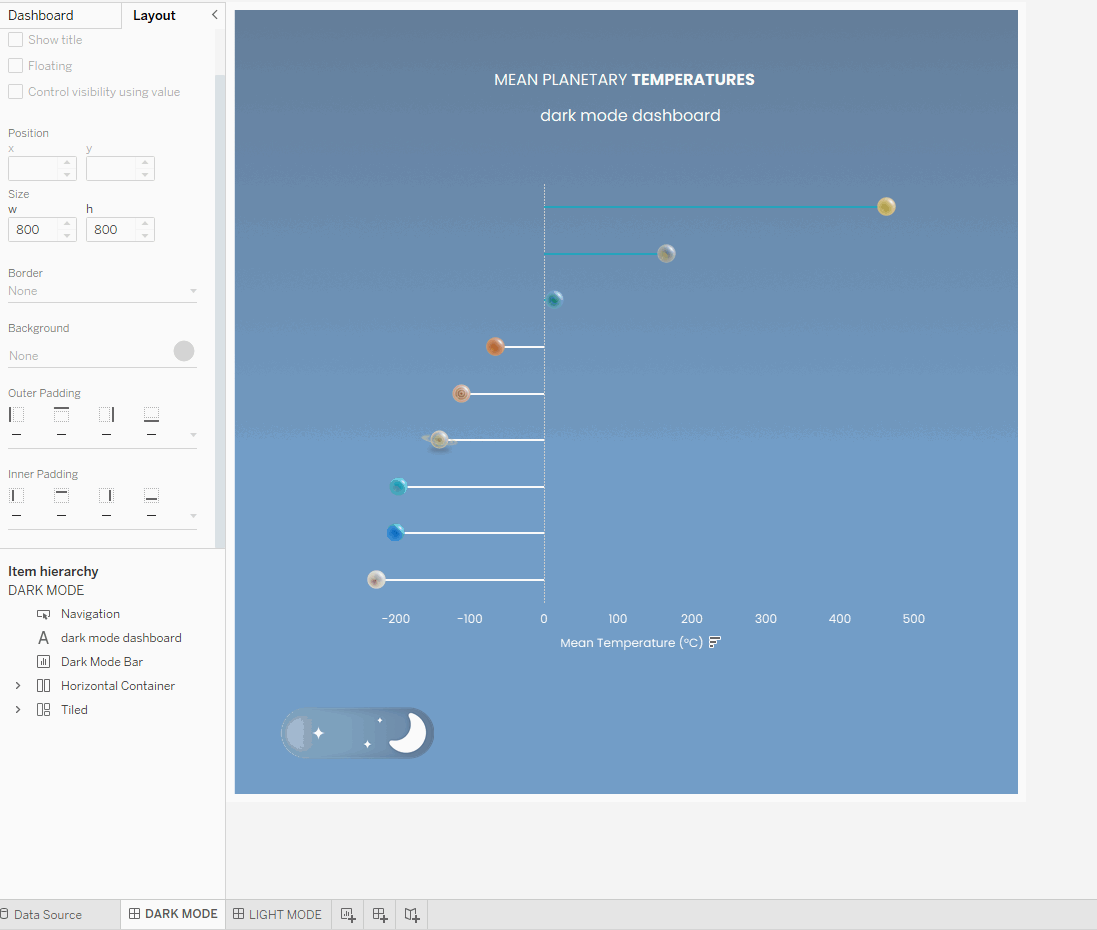
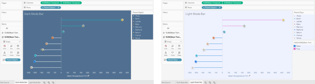
STEP 1: Duplicate your charts and elements to create both light and dark mode versions.
STEP 2: Create an integer parameter. Populate it with the values 0 and 1, and alias these as Light and Dark.
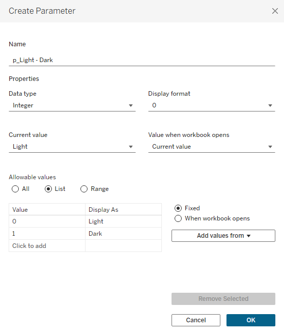
STEP 3: Create the following calaculated fields, using the parameter we created in the last step. These are boolean calculations, and will be used to set rules for the Dynamic Zone Visibility.
c_Show Light – DZV
[p_Light - Dark] = 0c_Show Dark – DZV
[p_Light - Dark] = 1STEP 4: Navigate to a dashboard page. Group the elements for each mode into containers, and bring your [p_Light – Dark] parameter onto the dashboard too.
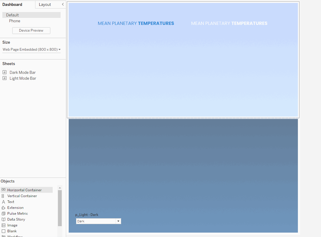
🌕 The containers help us align objects, so the switch between light – dark mode looks more seamless and things don’t shift around.
STEP 5: Navigate to the Layout pane on your dashboard.
Select the light mode element(s) / container and and tick ‘Control Visibility using Value‘. Select the c_Show Light – DZV calculation.
Repeat this process, this time applying the c_Show Dark – DZV rule to the dark mode element(s)/containers.
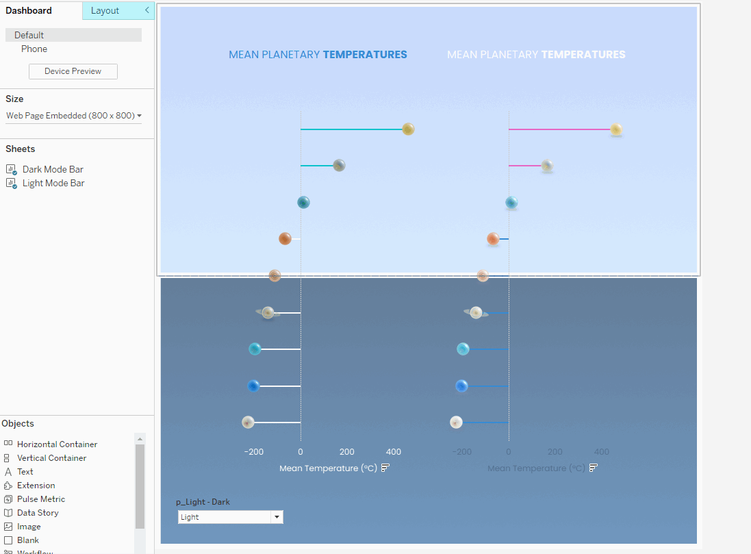
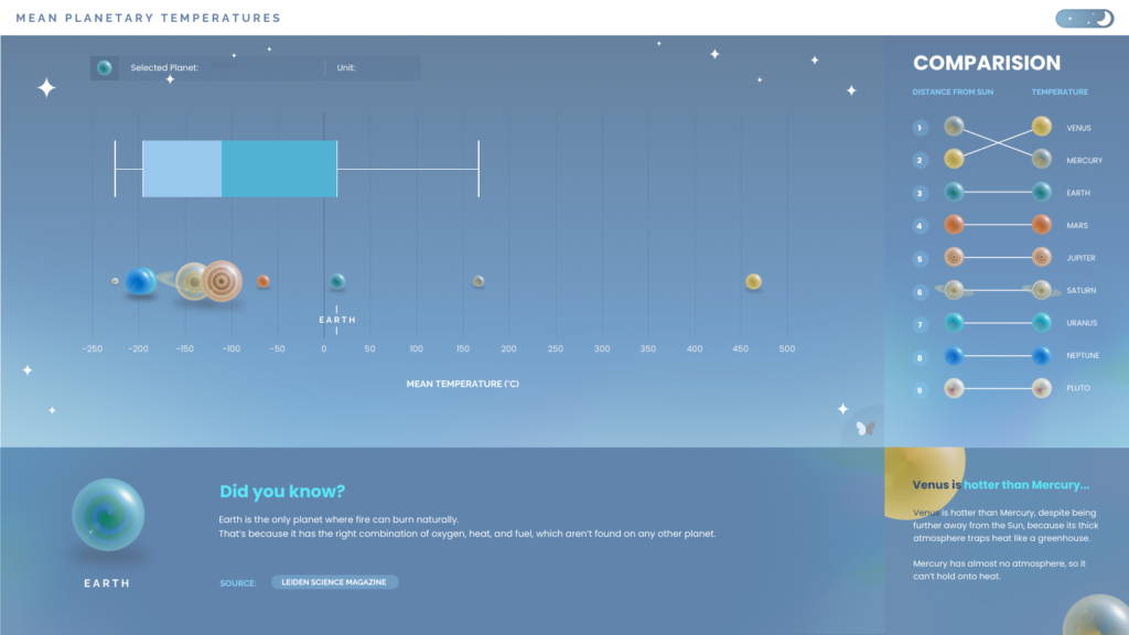
STEP 6: Use the parameter to test your light-dark mode visuals and ensure they transition smoothly as intended. Make any necessary adjustments, and once everything looks right, you’re all set! 💫
I followed the same steps for the background images in my viz, with the dark gradient displaying when the dark mode was selected. This approach keeps everything on one page, creating a seamless experience for users.
✨ For better performance, consider using dynamic calculations to adjust colours and styles directly in the same worksheets (where possible!), rather than duplicating them.
Optional: Dynamic Calculations for minor adjustments
Which brings me onto my final point.
If your light-dark mode changes are relatively simple, like adjusting mark colours, shapes, or text formatting, you can use parameter-driven calculations to do this. This method works well when you don’t need entirely separate designs for each mode.
✨ Note: If you’d like to change axis text, or gridline colours, you will need to duplicate the chart. These can’t be adjusted dynamically.
Customise with a toggle…
As the light – dark mode functionality originates from UI/UX design, a toggle is generally used in these interfaces to switch between modes. If you’d like to replicate this style, you can create your own custom toggle in either Figma or Powerpoint.
A common design is a sun/moon icon or a slider-style switch, but feel free to customise it to match your visualisation’s style. Once designed, import the toggle as an image and link it to your parameter or navigation button for switching between modes.

Final Thoughts
Incorporating light-dark mode into your Tableau visualisations is a great way to enhance the user experience and showcase your design skills! Whether you choose to use separate dashboards, Dynamic Zone Visibility, or parameter-driven calculations, each method has its strengths and challenges…
My advice? Experiment with both approaches to see what works best for your project. Even if it takes some trial and error, the process itself is a valuable learning experience.
If you use this guide to create a Light-Dark mode viz and found it helpful, I’d love to see what you’ve come up with! Feel free to tag me @datavizfairy on Twitter or Shreya Arya on LinkedIn ✨
🌕✨💫 Dataset used: B2VB – Week 13: Build a Box Plot