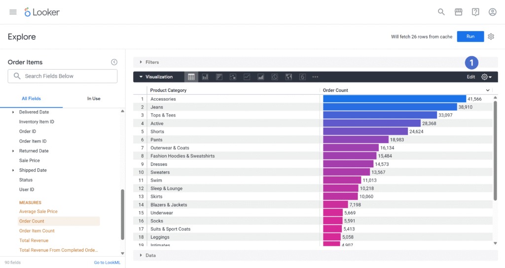
A little colour goes a long way…
Colour is a powerful pre-attentive attribute that can help people spot patterns and differences more quickly.
In Looker, there are a few ways to use colour to make a Table visualisation easier to scan.
Cell Visualisation
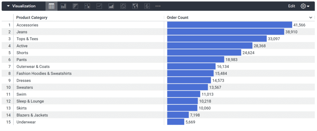
You can display measures as a ‘Cell Visualisation‘, also known as horizontal bars.
This combines the pre-attentive attributes of colour and length, making values easy to compare.
Conditional Formatting
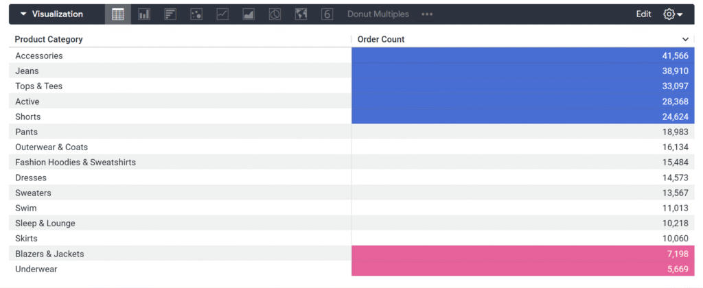
You can apply Conditional Formatting to cells based on rules you define so specific values or conditions stand out.
In this blog, we’ll be covering how to edit the colour settings for both styles in Google Looker.
Adjusting Colours 🎨
Cell Visualisation
When you create a Table Visualisation, the ‘Cell Visualisation’ display will be on by default if there are measures in your data table.
To customise it:
- Select Edit in the top-right corner
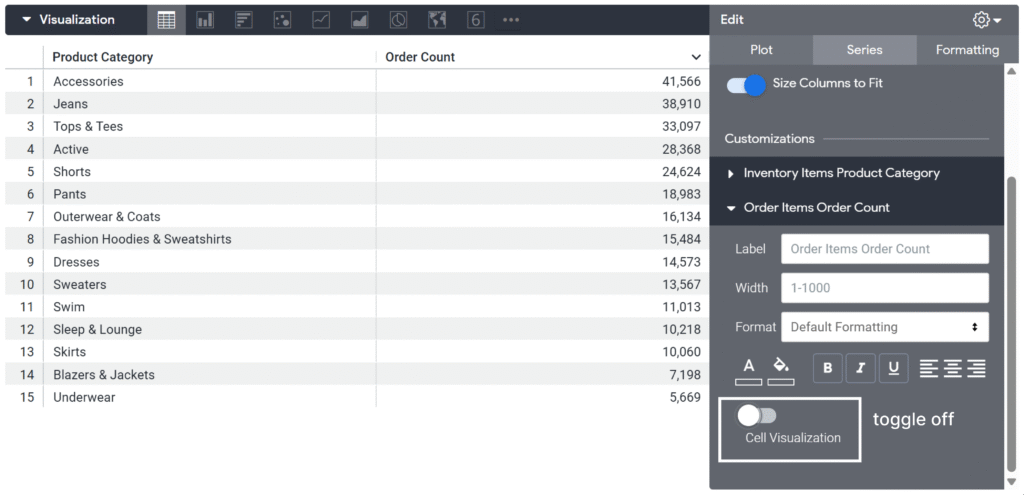
- Go to the Series Tab
- Under Customisations, select the measure you want to edit
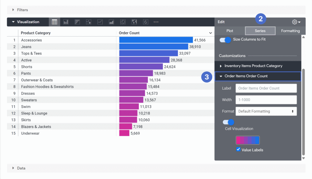
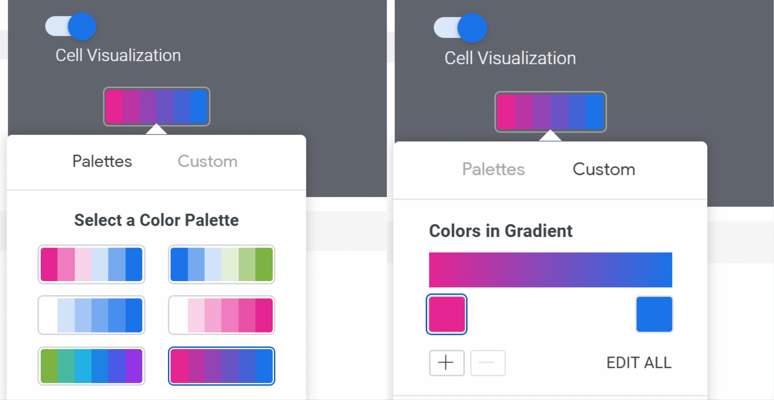
You’ll then see the Cell Visualisation settings for that measure. From here, you can change the colour palette or select Custom to choose your own colours.
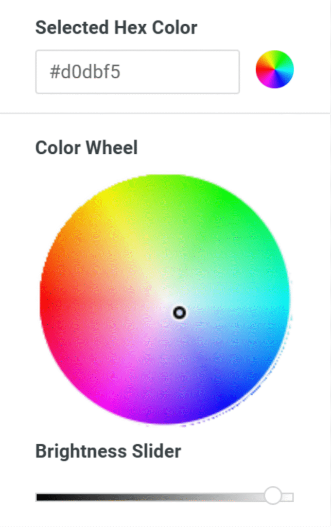
You can also type in your own HEX codes or select a new colour via the Colour Picker Wheel.
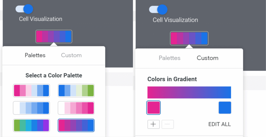
Tip: If your values range all positive or all negative, use a sequential palette. If you range has both positive and negative values, use a diverging palette!
For this example, Order Count can only contain positive values, so a sequential palette works well here.
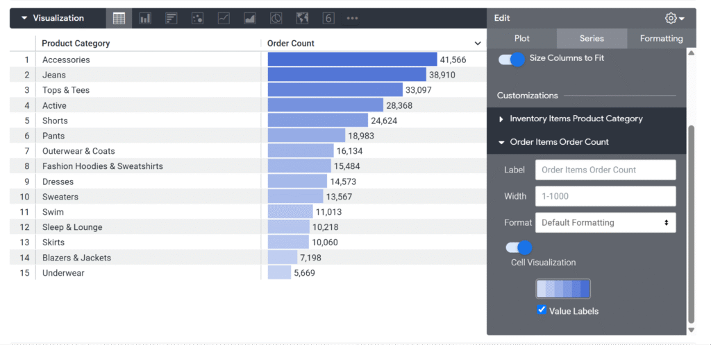
Conditional Formatting
Conditional Formatting works differently. It keeps the values displayed as cell values, but changes their formatting when they meet rules you define.
To use conditional formatting:
- Toggle off Cell Visualisation for the measure, so it displays as cell values
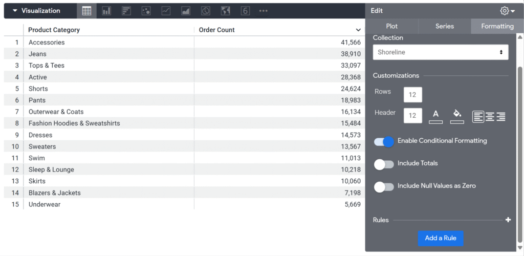
- Open the Formatting tab.
- Switch on Enable Conditional Formatting
- Select Add a Rule
You can then choose which field the rule applies to and define the condition. For example, you could apply formatting across a sequential scale, where larger values are brighter. Or you could create a rule that highlights values less than a particular number.
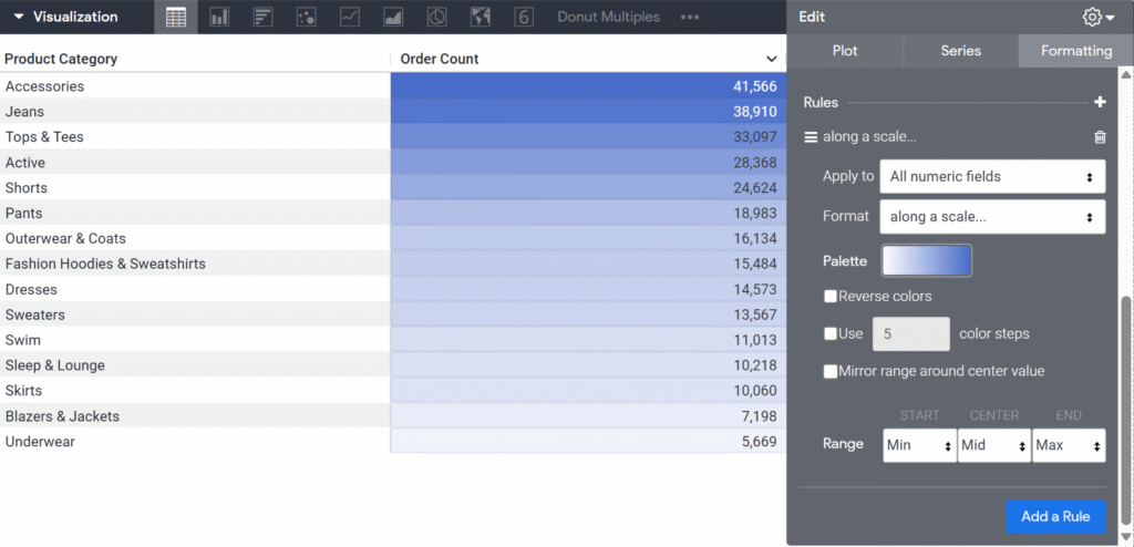
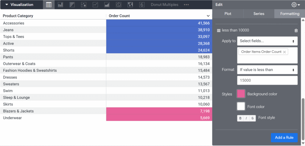
The formatting will then be applied wherever the condition is met.
Note: If Cell Visualisation is switched on, its colour settings will take precedence, so any Conditional Formatting rules will not be visible.
Final thoughts
There are lots of ways you can format and customise Table visualisations in Looker. While this tutorial focused on colour, there are plenty of other settings you can explore to make your tables clearer, easier to scan and better suited to what you want to communicate.
If you give this a go in Looker, I’d love to hear how you get on! Feel free to tag me @datavizfairy on Twitter / X or Shreya Arya on LinkedIn ✨